Font Collections / 8 Apr 2024
What Is a Descender in Typography?
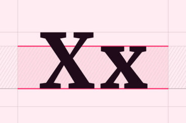
In the world of typography, every curve, line, and stroke plays a critical role in crafting readable and visually appealing text. Among these nuanced elements are descenders, the elongated tails on certain lowercase letters that dip below the baseline.
In this quick guide, we explore descenders, their significance in design, and the impact they have on legibility, aesthetics, and spacing in typographic works. Whether you’re a seasoned designer or a typography enthusiast, understanding descenders can enhance your appreciation and application of text design.
Let’s dive in.


