Font Collections / 16 Apr 2025
AI-Generated Fonts: Are Machines Designing the Future of Type?
Typography has always been a deeply human art form. From hand-lettered scripts to digital typefaces crafted with pixel-perfect precision, fonts reflect culture, emotion, and design sensibility.
But now, artificial intelligence is stepping into the world of type design—bringing with it questions, possibilities, and a new way of thinking about how fonts are made.
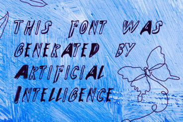
AI-generated fonts are quickly gaining attention as tools become more advanced and accessible. These tools can generate typefaces from scratch, suggest stylistic variations, and even learn a designer’s preferences over time.
While it’s still early days, it’s worth asking: Are machines truly capable of designing the future of type? And what does that mean for the role of the human designer?
Let’s find some answers.