Font Collections / 6 Feb 2026
20+ Best Imperfect Fonts for Unique Typography Designs
Sometimes the most interesting typography comes from fonts that embrace imperfection.
In this post, you’ll find imperfect fonts that bring raw energy, unexpected forms, and visual intrigue to your design work.
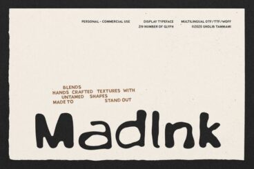
These fonts challenge symmetry, regularity, and traditional balance, offering alternative approaches to letterform design with their irregular baseline shifts, uneven curves, or quirky details that feel handcrafted.
These fonts work beautifully for experimental design, packaging, posters, and branding that wants to stand out. They’re especially effective when you want typography that feels expressive, artistic, and unlike anything generic.
With the right imperfect font, your design will feel authentic, dynamic, and refreshingly unpredictable.