1. Authors
  2. Jenifer Davies

Jenifer Davies

Jenifer Davies

Jenifer is a graphic design and video expert with years of experience in print and digital design, running a small business, and video marketing. She's a regular contributor to Design Shack, sharing her expertise and tips.

Voice UI & Accessibility: Designing for a Screenless World

Accessibility / 4 Jun 2025

Voice UI & Accessibility: Designing for a Screenless World

We’re entering a world where screens are no longer the only way people interact with technology.

From smart speakers to voice assistants on phones and wearables, Voice User Interfaces (VUIs) are reshaping how we search, shop, and connect.

And with that shift comes a growing need for designers to think beyond the screen, especially when it comes to accessibility.

Designing for voice isn’t just a matter of function. It’s about inclusion.

For many users with visual impairments, mobility limitations, or cognitive challenges, voice technology opens up new ways to engage with digital content independently. But for voice to truly be accessible, it must be thoughtfully designed.

In this post, we’ll explore the role of voice interfaces in accessible design, the challenges they present, and how to create voice experiences that are inclusive, intuitive, and effective in a screenless world.

15+ Best 3D Mockups for Photoshop, Spline, Filmbox & More

Mockup Templates / 3 Jun 2025

15+ Best 3D Mockups for Photoshop, Spline, Filmbox & More

Today, we’re bringing you an incredible collection of 3D mockups for presenting your projects in a realistic perspective that 2D just can’t match.

From photorealistic product displays in Photoshop, browser-based 3D mockups in Spline, and cinematic visuals in Filmbox, this collection has something for every designer, developer, and marketer looking to wow their audience.

Whether you’re working on a client pitch, a portfolio piece, or marketing materials, these mockups will help you showcase your work in a dynamic, professional way.

If you’re ready to take your design presentations to the next level, 3D mockups are the way to go.

Design Minimalism in 2025: Evolved, Not Extinct

Minimalist Graphic Design / 2 Jun 2025

Design Minimalism in 2025: Evolved, Not Extinct

Minimalism has long been a go-to style in the world of design, where simple layouts, muted palettes, and clean typography thrived across various platforms.

But over the past few years, many predicted its decline. With bold type, rich visuals, and maximalist design making a comeback, some even assumed minimalism was on its way out.

But in 2025, it’s clear that minimalism isn’t extinct. It’s evolved.

Minimalism has matured into something more nuanced. It’s no longer just about stripping away, now it’s about clarity, focus, and intentionality.

Designers aren’t rejecting minimalism; they’re refining it. And the result is a new form of minimalism that still feels clean and modern, but with a bit more personality and purpose.

In this post, we’ll explore how minimalism has changed, why it still matters, and how to use it effectively in today’s design landscape.

20+ Best British Fonts With Timeless Elegance & Style

Font Collections / 2 Jun 2025

20+ Best British Fonts With Timeless Elegance & Style

From classic serif styles to refined handwritten scripts, British fonts evoke a sense of tradition, charm, and understated elegance.

In this post, we bring you a collection of fonts inspired by British culture, design heritage, and timeless style. Think London high street signage, vintage tea labels, royal elegance, and crisp editorial layouts, all captured through beautifully crafted lettering.

These fonts are ideal for logos, packaging, event invitations, book covers, and any project that calls for a blend of sophistication and character.

Whether you’re designing for a luxury brand, a heritage-inspired product, or simply want to bring a bit of British flair to your work, these fonts can set the perfect tone.

Personalized Email Design: Merging Data With Good Design

UX Design / 31 May 2025

Personalized Email Design: Merging Data With Good Design

We all know the feeling of scrolling through a crowded inbox, skimming subject lines, and only clicking on the emails that actually feel relevant.

That’s where personalization comes in. But personalization isn’t just about inserting someone’s first name. It’s about using smart data and thoughtful design to create emails that feel tailored, timely, and worth opening.

When personalization meets great design, the result is more than just better click rates.

It’s a deeper connection with your audience. You’re not just sending emails, you’re starting conversations, offering value, and showing users you understand what they care about.

In this post, we’ll explore how to merge data and design effectively to create personalized emails that look great and perform even better.

Trendjacking With Design: Tap Into Viral Moments Without Going Off-Brand

Trends / 30 May 2025

Trendjacking With Design: Tap Into Viral Moments Without Going Off-Brand

Social media moves fast. One moment it’s a viral dance challenge, the next it’s a trending meme or a cultural event dominating every feed.

For brands and designers, this fast-paced environment creates a unique opportunity: trendjacking.

Done right, trendjacking lets your brand join the conversation, reach new audiences, and stay culturally relevant. But it’s also easy to miss the mark or feel off-brand.

That’s where design comes in. With the right visual marketing strategy, you can tap into trending moments while staying true to your tone, style, and audience.

In this post, we’ll explore what trendjacking is, how major brands have used it successfully, and how to create on-brand social media designs that ride the wave without going off course.

25+ Best Abstract Waves Backgrounds & Textures

Background Textures / 29 May 2025

25+ Best Abstract Waves Backgrounds & Textures

Abstract wave designs bring movement, depth, and fluidity to any creative project.

Whether you’re designing a website, social media graphic, poster, or presentation, these wave-inspired backgrounds and textures add a dynamic, modern touch that feels both artistic and effortless.

In this post, we’ve curated the best abstract wave backgrounds and textures, perfect for adding a sense of flow and sophistication to your designs.

From soft gradients and subtle line waves to bold, layered compositions, these visuals are versatile and easy to incorporate into a wide range of creative projects.

How to Spot Overused Templates and Avoid Design Fatigue

Graphics / 28 May 2025

How to Spot Overused Templates and Avoid Design Fatigue

Stock templates can be a lifesaver when you’re working on a tight deadline or juggling multiple projects.

Whether it’s a presentation deck, a social media graphic, or a flyer layout, using a ready-made design helps speed things up and keeps your workflow moving.

But there’s a trade-off. When everyone uses the same templates, designs start to feel generic, repetitive, and forgettable. This is where design fatigue sets in.

You’ve likely seen the same style of Instagram carousel, pitch deck layout, or YouTube thumbnail pop up over and over again. And so have your clients and their audiences.

The more familiar a template becomes, the less impact it has.

In this post, we’ll explore how to spot overused template designs, why it matters, and what you can do to keep your designs fresh and original, even when you’re using stock resources.

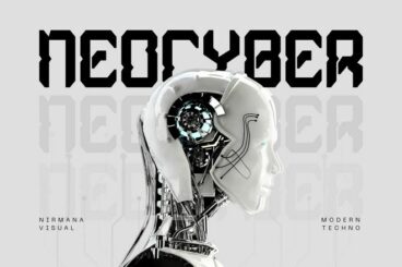
25+ Best Futuristic Robotic Fonts

Font Collections / 27 May 2025

25+ Best Futuristic Robotic Fonts

If your design project calls for a cutting-edge, tech-savvy look, nothing delivers that vibe better than a futuristic robotic font.

In this post, we’ve gathered a collection of the best futuristic robotic fonts with designs that range from ultra-modern and minimal to glitchy, cyberpunk-inspired styles.

Inspired by sci-fi films, artificial intelligence, and sleek digital interfaces, these fonts are perfect for designs that need to feel innovative, mechanical, or just plain cool.

Whether you’re creating a logo for a tech brand, designing a poster for a sci-fi concept, or working on UI elements for a digital product, these fonts bring the future to life. Check them out below and start downloading.

Sticky vs. Dynamic Navigation: Which Improves Engagement?

Navigation / 26 May 2025

Sticky vs. Dynamic Navigation: Which Improves Engagement?

Navigation is one of the most important elements in web design. It’s how users explore your content, interact with your brand, and ultimately decide whether to stay or leave.

But as websites have evolved, so have the ways we design navigation. Two approaches in particular, sticky and dynamic navigation, have become common in modern interfaces.

Both styles aim to make the user experience smoother, but they take different paths to get there.

Sticky navigation keeps key links always visible, no matter how far you scroll. Dynamic navigation changes as the user interacts, creating a cleaner and more adaptive experience.

So, which one actually drives better engagement? And how do you decide which is right for your site?

In this post, we’ll break down the pros and cons of each, look at where they work best, and help you choose a navigation style that supports your content, your audience, and your goals.

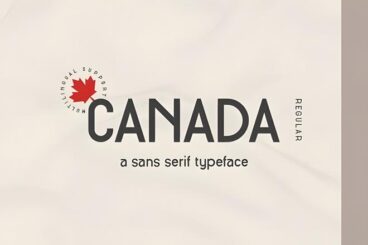
20+ Best Canadian Fonts With Versatile and Friendly Vibes

Font Collections / 26 May 2025

20+ Best Canadian Fonts With Versatile and Friendly Vibes

Looking to add a warm, approachable feel to your designs with a hint of Canadian character? Then this font collection if perfect for you.

In this post, we’ve rounded up the best Canadian fonts, from clean, modern sans-serifs to rustic, outdoorsy styles and hand-lettered fonts that feel cozy and inviting.

Whether you’re working on branding, packaging, travel materials, or local-inspired projects, these Canadian fonts offer the perfect blend of versatility and charm.

Each font captures a different aspect of Canadian identity, whether it’s the calm of a forest trail, the friendliness of a local coffee shop, or the bold clarity of a national brand. Be sure to download them all!

Mobile Microcopy: Writing UI Text for Tiny Screens

UX Design / 24 May 2025

Mobile Microcopy: Writing UI Text for Tiny Screens

In mobile UI design, every word counts.

With limited space and even less user attention, writing microcopy for mobile interfaces is more than just squeezing content into smaller screens; it’s about making every message clear, helpful, and human.

Mobile microcopy includes things like button labels, placeholder text, error messages, onboarding hints, and confirmation notes. These small pieces of text may not seem like a big deal, but they have a huge impact on the user experience.

They guide people through actions, reduce friction, and help apps feel more intuitive.

In this post, we take a look at how to write effective UI text for mobile, the challenges that come with small screens, and tips for making microcopy clear, friendly, and useful.