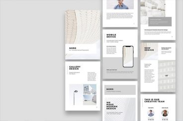
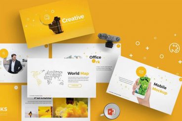
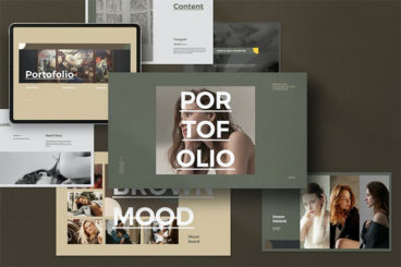
Accessibility / 22 Jan 2025
Dark Mode and Accessibility: Finding the Right Balance
It didn’t take long for the “dark mode” to become a requirement for every user interface design. What started out as a design trend turned into a must-have feature for offering a comfortable user experience.
Due to its popularity, every type of design, from the UIs of operating systems on computers to websites, mobile apps, and even print designs now features a dark mode option.
According to a survey by Android Authority, 81.2% of 2,514 users claimed they prefer dark mode on their phones over light mode. It’s quite effective on desktop as well. After switching to a dark mode theme, a company was able to reduce the bounce rate by 60% and boost pageviews by 170% on their website.
But not everyone gets it right. Dark mode design is more than about adding a black background to a design. It’s about improving accessibility while balancing aesthetics at the same time. This process comes with some challenges as well.
In this post, we explore the importance of implementing dark mode in designs and discuss the benefits and the challenges that come with it. Let’s dive in.