Articles / 13 Apr 2012
How to Sell Your Design Idea
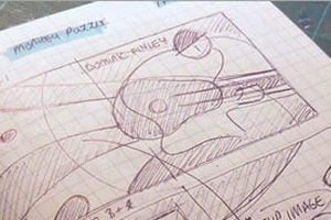
Sometimes getting others to visualize your great idea is not so simple and takes some “selling” on your part. It may even take advance (or free) mock-up work to help some of the non-visual people in the room get on the same page with your idea.
Here are a few things you can do to help you get your idea on the fast-track to approval and how to really sell your design concept.