Layouts - Page 7

Advice for crafting layouts and structure that can create a clear, original web design. Break the mould, and build a unique layout!

Minimalist Design Is Taking Over: Here’s Why

Minimalist Graphic Design / 15 Jun 2015

Minimalist Design Is Taking Over: Here’s Why

Everywhere you turn, another designer is releasing a project featuring a minimalist design style. This focus on space, simplicity and beautiful typography is refreshing. And it’s a great option for a number of design projects. That might be one of the reasons minimalist design is so popular.

But the trend is not brand new. Minimalism has been around almost as long as design itself. It’s a technique that ebbs and flows, but always remains as one of the classic styles, making it a design choice that almost always works.

Interaction Design: What Is It, and How Can You Use It?

Graphics / 8 Jun 2015

Interaction Design: What Is It, and How Can You Use It?

Interaction design might be the most talked about design concept of 2015. It’s something you should be thinking about and planning for in all of your digital projects.

But how can you make the most of interaction design? How can you design something people want to interact with? While some of those answers are changing with technology, one element remains the same – people want to use design that is intuitive, functional and aesthetically pleasing.

Asymmetrical Design: Creating Beautiful, Balanced Layouts

Layouts / 3 Jun 2015

Asymmetrical Design: Creating Beautiful, Balanced Layouts

How do you feel about asymmetrical design? That simple question can sometimes spark a lot of debate among designers. Asymmetrical design can be one of the more complicated techniques to pull off, but when done well results in beautiful and eye-catching designs.

While the definition of asymmetry is the lack of symmetry or equality between two halves; it is not a lack of balance as some wrongly assume. Designers can use asymmetry to create balance and harmony even though two sides of the design do not mirror one another. Here’s how to get started.

Visual Composer: A Drag-and-Drop WordPress Page Builder

Layouts / 28 May 2015

Visual Composer: A Drag-and-Drop WordPress Page Builder

WordPress powers a large percentage of the web, and it’s a famously easy-to-use content management system. But creating immersive, in-depth pages and layouts can be a tricky process.

Visual Composer is a plugin that lets you take full control over your WordPress site, and build any layout you can imagine. It’s all based around adrag and drop page builder interface, doesn’t require any programming knowledge, and is really simple to get started using. Today we’re going to be taking a look at how it works, and sharing a few examples of how it’s powering some lovely WordPress designs!

The (Sometimes Hidden) Meaning of Shapes

Layouts / 12 May 2015

The (Sometimes Hidden) Meaning of Shapes

The shapes of objects in your design may be sending a message to users that you aren’t even aware of. Whether you put an image inside a square or circle or triangle can have an impact on what people think about that image.

Sometimes a shape is more than just a group of connected lines. The use of shapes can be obvious or subtle and appear within images or as elements in a design. Here, we will look at common shapes used in design projects and the signals they may convey.

4 Simple Tips for Writing Copy That Matches Your Design

Graphics / 21 Apr 2015

4 Simple Tips for Writing Copy That Matches Your Design

When it comes to design projects, sometimes we (designers) get caught in a trap: creating a design without understanding the content. The first step to creating an outstanding project – before you ever open a piece of software – is to read over the content. Then think about the design and how the copy goes with it.

Does the copy actually need to match the design? Should designers help write the copy? Yes, most definitely. (As a bonus, all images in this post are examples of great copy and design pairings from the Design Shack gallery.)

How to Design a Killer Annual Report

Business / 19 Mar 2015

How to Design a Killer Annual Report

Regardless of when your company’s fiscal year ends, you probably want to start thinking about the dreaded annual report today. Yes, “dreaded.” But it does not have to be. While annual reports are often seen as a design drag, there are plenty of ways to turn this report into a fun and memorable design project. And with better design comes more reading and retention, two positives for your brand.

You need to start thinking about it now. Don’t wait until the report hits your desk to determine a design strategy. Start talking to your team about your story for the year and how to create an annual report that will get people talking.

The Complete Guide to an Effective Card-Style Interface Design

Layouts / 18 Mar 2015

The Complete Guide to an Effective Card-Style Interface Design

Card-style architecture is one of the biggest things in web design, and mobile design in particular. From apps to responsive websites, the card-style format is popping up everywhere.

And for good reason. Mobile card design looks nice, works well on a variety of devices and creates distinct organization and a method for content delivery. That’s why many large, well-known brands are using the card format and many smaller design and development groups are following suit.

How to Design an Email People Will Actually Read on Their Phones

Layouts / 2 Mar 2015

How to Design an Email People Will Actually Read on Their Phones

Email marketing is one of the most popular ways to reach an audience. Wait, that’s probably not new information. But did you know what a majority of those views will be on a mobile device? So if you are not designing your emails for phones, this is the day to start.

Designing a mobile email takes planning and thought. Many third-party email software clients include responsive templates in their packages, but not every tool will automatically convert your message to the idea design. You need to think out how your email will look and make sure the message is focused. It might even be the perfect place to start with a mobile-first design strategy.

Minimal Design: How to Design More With Less

Minimalist Graphic Design / 23 Feb 2015

Minimal Design: How to Design More With Less

Minimalism and the use of whitespace are big design trends right now. Mastery of these techniques might look easy at first glance, but it is actually quite difficult to design with so much open space and so few objects. It can be hard for clients to come to terms with because they often want as much information as possible on a canvas.

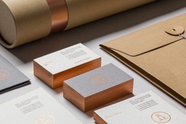
But many designers like the look of minimal styles and maximizing whitespace can be a fun challenge. It’s a technique that translates well across mediums and can be used in print, web design and on packaging. Here, we’ll look at the trend and how to design more with less.

Understanding and Working With Aspect Ratio

Layouts / 17 Feb 2015

Understanding and Working With Aspect Ratio

Every image, every canvas, every frame has a shape. And often that shape is a rectangle. Even more common is a rectangle of a particular proportion based on medium.

From cameras to television to movies to computer screens, every medium has an almost distinct shape on to itself. That can be a challenge for designers, especially when you have to crop and convert content and information to fit a variety of mediums. Because of all these different shapes, understanding aspect ratios can help you easily move images and designs from one medium to another.

Looking at Images: Phi Grid vs. Rule of Thirds

Layouts / 9 Feb 2015

Looking at Images: Phi Grid vs. Rule of Thirds

When you are thinking about images, do you consider framing and the shape of the crop? The answer does not lie in the shape of the box you just created on a design canvas. It has a lot to do with the content of the image itself.

How you frame and crop images can impact engagement and even how a person looking at the image feels about it (whether they know it or not). Here, we’re going to look at two different ways of thinking about images – using the phi grid and rule of thirds — and how you can apply them to your work.