Layouts / 17 Feb 2014
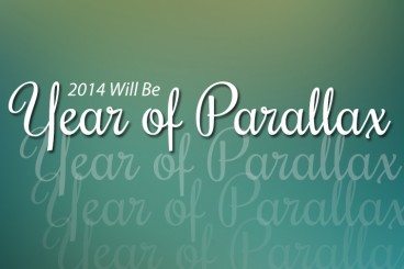
2014 Will Be Year of Parallax
A somewhat bold prediction: 2014 will go down as the year of parallax. Before you downplay this reemerging trend, think about it. With developments in HTML, CSS and jQuery, and more people running on high-speed internet connections it is not a stretch to think this nifty technique will really explode this year.
Parallax scrolling effects are fun, user friendly and allow for new types of creative thought in the website design process. The end result is a technique that can be fun to create and can create a highly visual and interactive experience for users.