Articles - Page 128

Browse hundreds of articles, tips, and inspiring design collections. Find helpful design advice, or the perfect resource for your next project.

CSS Card Tricks

CSS / 26 Dec 2012

CSS Card Tricks

Know any good card tricks? Hopefully, after today, you will! We’re going to build some simple and attractive playing cards with pure CSS, then we’ll learn how to target and animate each card for some added fun.

Along the way, we’ll see how to use before and after to build the cards with minimal markup. Let’s get started!

7 Awesome Emmet HTML Time-Saving Tips

CSS / 17 Dec 2012

7 Awesome Emmet HTML Time-Saving Tips

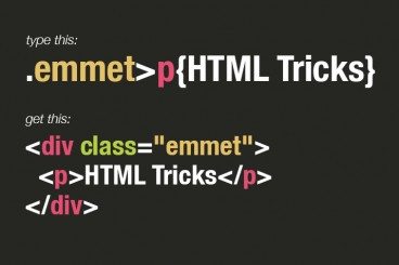
Emmet, formerly Zen Coding, is one of the most downright practical and productive text editor plugins that you will ever see. With its ability to instantly expand simple abbreviations into complex code snippets, Emmet makes you feel like a powerful coding wizard with the world at your fingertips.

Today we’re going to dive into seven awesome tips to help you become a true Emmet pro.

7 Great Tools to Help You Build Your Own HTML5 Forms

HTML / 27 Nov 2012

7 Great Tools to Help You Build Your Own HTML5 Forms

Forms can be one of the most complex aspects of your front-end development work. They’re far more complicated than most of the items that you’ll work with from both an HTML and CSS perspective.

If you’ve been frustrated with forms in the past, don’t worry, there is hope! Today we’re going to go over some tools and frameworks that help you get the job done without the headaches.

The New Wendy’s Logo: What Went Right

Inspiration / 30 Oct 2012

The New Wendy’s Logo: What Went Right

Logo updates are a precarious business. One wrong move and you’ll have an angry mob calling for your head. This is especially true with brands that people have literally interacted with for the majority of their lives.

Today we’re going to take a look at just such a brand. Wendy’s, the self-proclaimed old fashioned hamburger joint, has a brand new logo. Spoiler alert: it’s great, especially when compared to the recent Arby’s update. So what went right here compared with what we saw with Arby’s? Let’s take a look.

The New Arby’s Logo: Better or Boring?

Inspiration / 15 Oct 2012

The New Arby’s Logo: Better or Boring?

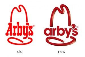
Everyone’s favorite roast beef sandwich fast food chain (ok, maybe the only roast beef fast food chain anyone can name) just jumped headlong into a brand refresh. Their new logo, menu and website is meant to bring the admittedly old-timey restaurant into the 21st century.

The question of course is, did they succeed? Follow along as we take a look at the logo and website to see what we think.

Finally, Collect for Output in Illustrator

Software / 25 Sep 2012

Finally, Collect for Output in Illustrator

For over a decade, a fierce debate has raged on about whether or not Adobe Illustrator is an appropriate tool for page layout projects. Should you really be building ads and brochures in an application meant for illustration?

The question is an interesting one, and those in the “yes” camp have always been held back by the simple lack of a “Collect for Output” feature. This has finally changed in CS6. So is the debate over? Not remotely. Read on and join the discussion.

30 Great Looking Web Designs Built With Diagonal Lines

Inspiration / 24 Sep 2012

30 Great Looking Web Designs Built With Diagonal Lines

Too often, we fall back on the same old design techniques and aesthetic feel. Why not mix it up every now and then and try something new? One technique that really seems to be gaining traction lately is the implementation of strong diagonal lines in web design.

After years of strict, standard grids that utilize clear vertical and horizontal directionality, a bold diagonal design can make a refreshing statement that’s eye-catching and attractive. Read on to see thirty recent examples of designers using diagonal lines in their work.

The Master Guide to the Photoshop Layers Panel

Software / 10 Sep 2012

The Master Guide to the Photoshop Layers Panel

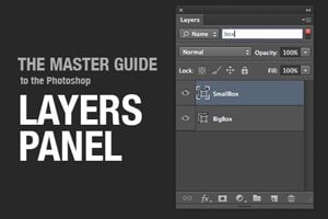
The Layers Panel in Photoshop is one of the single most important aspects of the software’s UI. Odds are, you’ve spent a good chunk of your life staring at and interacting with the Layers Panel, but how well do you really know it?

Today we’re going to take a deep dive into what the Layers Panel has to offer and how to make the most of it in your workflow. We’ll learn about everything from keyboard shortcuts to obscure customization features. Whether you’re a beginner or a pro, you’re bound to learn a few new tricks!

Art vs. Design: Are They the Same Thing?

Inspiration / 29 Aug 2012

Art vs. Design: Are They the Same Thing?

Every project is created by design. It is thought out, analyzed and finally, designed and executed.

But is every design project also a work of art? How similar (or different) are the processes and results? You may find that every designer or artist has a different definition. Here I will share my characteristics of each. (Feel free to agree with or even challenge me.)

A Beginner’s Guide to Using Google Web Fonts

Google Fonts / 1 Aug 2012

A Beginner’s Guide to Using Google Web Fonts

When Google Web Fonts was first released, we wrote up a quick walkthrough. Since then, the service has been completely overhauled and it’s high time for a thorough walkthrough from scratch.

Join us as we start at the very beginning and discuss what the Google Web Fonts service is and how to get it up and running on your site today.

Give us a few minutes of your time and we’ll open you up to the awesome world of awesome free web fonts.

Leveraging Stereotypes in Design: Masculine vs. Feminine Typography

Typography / 19 Jul 2012

Leveraging Stereotypes in Design: Masculine vs. Feminine Typography

Can type have a gender? Is it even socially acceptable to ask such as question? Putting aside any sort of nonsensical gender bias, it’s absolutely the case that typography can and does suggest a level of masculinity (or a lack thereof).

Today, we’re going to jump into what makes a typeface feminine vs. masculine. More importantly, we’ll talk about why this matters and and how it should influence your design work.

25 Amazingly Bizarre Minor League Baseball Logos

Inspiration / 16 Jul 2012

25 Amazingly Bizarre Minor League Baseball Logos

Being familiar with my love of logos and tendency to point out crazy design, a friend of mine recently showed me a fascinatingly bizarre niche of design of which I had, up to now, been entirely ignorant: Minor League baseball team logos.

When I tell you to prepare yourself for some of the zaniest examples of professional logo design that you’ve ever seen, I’m using neither exaggeration nor hyperbole. Buckle your seat belts, you’re in for quite a ride.