Articles - Page 125

Browse hundreds of articles, tips, and inspiring design collections. Find helpful design advice, or the perfect resource for your next project.

The Science Behind Color and Emotion

Graphics / 30 Jun 2014

The Science Behind Color and Emotion

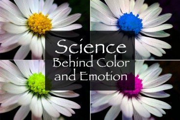
Color resonates with people in different ways. We all have a favorite color or color that we use more during specific periods of life. But the color you use in a design project can say a lot about the work itself. That’s a scientific fact.

The science behind our emotional connections to color is a complicated one. But it is becoming more clear through anecdotal knowledge and scientific experimentation. Here are five hypotheses and a fifth-grade level experiment you can try to help us better design with color and understand its emotional impact.

Design Science: What Is Gestalt Theory?

Inspiration / 18 Jun 2014

Design Science: What Is Gestalt Theory?

If you are like me, it’s been a while since you finished you last formal design class. (And some of us never had any formal design classes.) So a refresher in some of the science behind design seems important. What is gestalt theory and do I really need to understand it?

Today, we’ll focus on one of the guiding principles of design. Gestalt theory is something you likely encounter and use almost every day. But do you understand the theory behind your actions? And how can you make even better use of this concept in your design work?

How to Use Cool Color in Design Projects

Inspiration / 10 Jun 2014

How to Use Cool Color in Design Projects

Cool and warm colors. These descriptions are commonly used to describe hue choices in a variety of conversations – fashion, beauty, decorating and design. But while we commonly talk about warm and cool, do you really know what these terms mean and how to use the colors?

Today, we will look at using cool color in design projects and create a few color palettes with cool hues. (Also make sure to check out the recent Design Shack article featuring warm colors.)

How to Use Warm Color in Design Projects

Inspiration / 2 Jun 2014

How to Use Warm Color in Design Projects

Warm and cool colors. These descriptions are commonly used to describe hue choices in a variety of conversations – fashion, beauty, decorating and design. But while we commonly talk about warm and cool, do you really know what these terms mean and how to use the colors?

Today, we will look at using warm color in design projects and create a few color palettes with warm hues. We’ll also investigate the theory and meaning behind different choices.

5 Tips for Creating a Fun Summer Color Palette

Inspiration / 19 May 2014

5 Tips for Creating a Fun Summer Color Palette

The official start of summer is just around the corner. Longer days, warmer temperatures and splashing in the lake or pool are just a few of the things that come with the change in season. When it comes to design, a change in seasons can create the urge to update your color palette as well.

With warmer days, warmer colors, brighter hues and even the use of more color are popular. And while you may not want to change the color scheme of an existing project — although you can – this season can be a great inspiration for designing a project with a summer-inspired color palette. Here are five tips for creating a great color palette with a few swatches to try based on each concept. Happy summer!

The Complete Guide to Special Characters

Typography / 21 Apr 2014

The Complete Guide to Special Characters

Not everything is as easy as ABC or 123. Sometimes your copy might require a character outside of the basic alphabet. That’s where special characters and glyphs come in. (Look around, they are more common than you might think at first.)

Depending on your workflow, inserting a glyph can be as simple as a keystroke or a multi-step process. Much of it depends on the software you are using, typography palette and how the final product will be published. Here, we are going to take a look at special characters, examples of use and tips for success.

Tips for Designing Better Mobile Typography

Mobile / 5 Mar 2014

Tips for Designing Better Mobile Typography

Mobile is big right now. But often the typography is small. When it comes to creating great type on small screens, there are plenty of challenges.

So how can you make the most of responsiveness, mobile design and typography? The first step is really understanding type and the second is by thinking about how people read. Put the two together and you will get a handle on creating great mobile type in no time. It’s a skill that every designer needs to master in the digital age.

Creating Visual Hierarchy With Typography

Typography / 3 Mar 2014

Creating Visual Hierarchy With Typography

Visual hierarchy is an important element in any design project. It tells people where to look and what things on the screen or printed page are most important. Hierarchy gives readers a sense of how to actually read material from start to finish with visual cues and flow.

While you can create visual hierarchy using a number of different tools, today we are going to look at ways to create structure with just typography. (And take a look at the images used throughout this post; they are all examples of great type hierarchy in action.)

Why I Love Ampersands & You Should Too

Typography / 10 Feb 2014

Why I Love Ampersands & You Should Too

Without a doubt, the most beautiful character in the English language is the ampersand. The single character comes in so many fashions – from the simple & to the casual E- to t-style representations.

But where did this character come from? What does it mean? And most importantly how can you take advantage of using it in your design projects? Here we will take a look at my favorite character from its history to uses and a gallery of great ampersands to inspire you.

Understanding Design Copyrights and Trademarks

Business / 27 Jan 2014

Understanding Design Copyrights and Trademarks

Not that long ago we entertained a discussion about design plagiarism here on Design Shack, but what does it mean if your work is stolen? How do you even know if your work is protected? And moreover, what can you do about it?

That’s where the protection of copyrights and trademarks come in. But what are they? And how do they apply to your designed work? Let’s take a look.

Why You Should Be Sketching (Even if You Can’t Draw)

Inspiration / 13 Jan 2014

Why You Should Be Sketching (Even if You Can’t Draw)

The first part of any project, print or digital, should start on paper. Sketching can be an integral part of any design process — even if you can’t draw.

But who needs to sketch? Just artists and illustrators are required to put pen to paper, right? Wrong! Today we’ll take a look at why sketching can be an integral part of everyone’s design and brainstorming process.

6 Famous Logos That Leverage Inconsistent Design

Graphics / 29 Dec 2013

6 Famous Logos That Leverage Inconsistent Design

One of the most powerful tools that you can use to improve any design is repetition. Repeating colors, shapes and other visual elements throughout a design increases consistency and familiarity so that the design feels more attractive.

But what about the flip side of this idea? Is it possible to wield inconsistency in such a way that it improves the quality of a design? It turns out that lots of well known logos use this very tactic. Read on to see what they are.