Articles - Page 123

Browse hundreds of articles, tips, and inspiring design collections. Find helpful design advice, or the perfect resource for your next project.

30 Premium Tumblr Themes With Beautiful, Minimal Design

Tumblr Themes / 29 Apr 2015

30 Premium Tumblr Themes With Beautiful, Minimal Design

There are thousands of Tumblr themes all over the web. To be perfectly frank, most of them aren’t great, and won’t do your creative work justice. Today we’ve collected thirty of our favourite premium Tumblr themes from across the web.

All of these cost a few dollars, but all of them will take your Tumblr blog to another level. From stylish, minimal Tumblr themes, through to those featuring big colours and bold images — we have a full selection. All of them are available to buy straight from Tumblr directly, and can be set up on your blog in a few minutes!

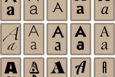
How to Design the Perfect Award or Certificate

Inspiration / 28 Apr 2015

How to Design the Perfect Award or Certificate

Do you ever catch one of those oddball assignments in your design career? Creating a great award or certificate design is one of them. The piece seems like a small task, but has a long shelf life, and is of high value to the recipient, making it important to design well.

But how do you even design a good award? Where do you start? Here’s a primer that takes a look at a few of the most important things to consider with award and certificate design.

7 Tips for Choosing the Best Web Font for Your Design

Typography / 30 Mar 2015

7 Tips for Choosing the Best Web Font for Your Design

There’s no way to quantify all of the font options available for website designers. Almost every day a new typeface shows up in my inbox or Twitter feed. But not every one one of these typefaces – no matter how beautiful – is right for designing a website.

When it comes to selecting the perfect font, you have think about a variety of things including compatibility, load time and design purpose. Today, we have seven tips to help you select and use the best web font for your design project.

10 Tips for Delicious Menu Design

Inspiration / 25 Mar 2015

10 Tips for Delicious Menu Design

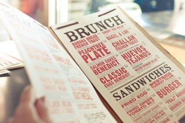
Have your ever thought about the way food items were presented to you on a menu? Can something as simple as a menu design determine what and where you will eat? Creating a design for a restaurant menu – paper copies for the table and online versions – is a vital part of the food industry because the way things look can impact sales.

The topic got recent attention thanks to Brian Wansink, who wrote “Slim By Design” and a recent paper for the International Journal of Hospitality Management, asserts menu design can impact exactly what someone orders. And it is all based on simple elements that we use every day from bold lettering to images to creating hierarchy on the canvas. Here are 10 ways you can use some of that information and other techniques to create an absolutely delicious menu design.

The Complete Guide to an Effective Card-Style Interface Design

Layouts / 18 Mar 2015

The Complete Guide to an Effective Card-Style Interface Design

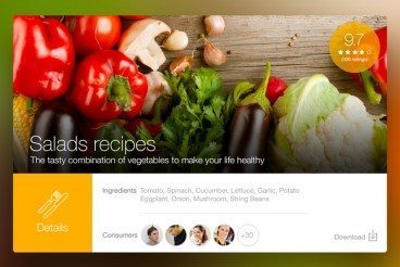
Card-style architecture is one of the biggest things in web design, and mobile design in particular. From apps to responsive websites, the card-style format is popping up everywhere.

And for good reason. Mobile card design looks nice, works well on a variety of devices and creates distinct organization and a method for content delivery. That’s why many large, well-known brands are using the card format and many smaller design and development groups are following suit.

10 Tips for Designing Icons That Don’t Suck

Graphics / 12 Mar 2015

10 Tips for Designing Icons That Don’t Suck

Almost every designer is thinking about app design these days. One of the smallest features of every app is the icon used to represent it on the screen of every mobile device and in the app stores. Designing a great icon is more than just putting a logo in a box. You need something that stands out among all the other app icons out there.

A good icon can be used in a variety of ways – for apps, social media and even on smaller printed projects or business cards. And all it takes is a little design and planning.

Google Material Design: Everything You Need to Know

UX Design / 24 Feb 2015

Google Material Design: Everything You Need to Know

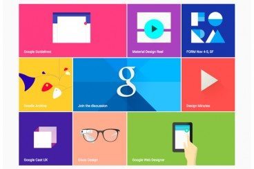
You probably keep hearing the phrase “material design” popping up in conversations. The concept is pretty new; it was introduced in the summer and references a new design language from the folks at Google.

But material design is more than just an idea; it is likely to cause designers to completely rethink web and app design processes. Sites are already beginning to role out design schemes using Google’s material design documentation. So now is the time to learn what it’s all about and if a material design framework is in your future.

Minimal Design: How to Design More With Less

Minimalist Graphic Design / 23 Feb 2015

Minimal Design: How to Design More With Less

Minimalism and the use of whitespace are big design trends right now. Mastery of these techniques might look easy at first glance, but it is actually quite difficult to design with so much open space and so few objects. It can be hard for clients to come to terms with because they often want as much information as possible on a canvas.

But many designers like the look of minimal styles and maximizing whitespace can be a fun challenge. It’s a technique that translates well across mediums and can be used in print, web design and on packaging. Here, we’ll look at the trend and how to design more with less.

Understanding and Working With Aspect Ratio

Layouts / 17 Feb 2015

Understanding and Working With Aspect Ratio

Every image, every canvas, every frame has a shape. And often that shape is a rectangle. Even more common is a rectangle of a particular proportion based on medium.

From cameras to television to movies to computer screens, every medium has an almost distinct shape on to itself. That can be a challenge for designers, especially when you have to crop and convert content and information to fit a variety of mediums. Because of all these different shapes, understanding aspect ratios can help you easily move images and designs from one medium to another.

6 Tips for Designing Signs and Billboards

Graphics / 16 Feb 2015

6 Tips for Designing Signs and Billboards

Your next project assignment: designing a sign for an upcoming event. It will be displayed on billboards around town and printed on smaller yard signs as well. If you are already panicking at the idea, don’t worry — designing a sign is not much different than any other project.

The big difference is scale. It’s going to be a lot larger in size than what you might be used to. Other things to think about when designing signage are location, color, typography, contrast and material the sign will be printed on. Thinking about each of these factors in advance can make for a better sign design experience.

Looking at Images: Phi Grid vs. Rule of Thirds

Layouts / 9 Feb 2015

Looking at Images: Phi Grid vs. Rule of Thirds

When you are thinking about images, do you consider framing and the shape of the crop? The answer does not lie in the shape of the box you just created on a design canvas. It has a lot to do with the content of the image itself.

How you frame and crop images can impact engagement and even how a person looking at the image feels about it (whether they know it or not). Here, we’re going to look at two different ways of thinking about images – using the phi grid and rule of thirds — and how you can apply them to your work.

10 Tips for Designing Static Ads

Graphics / 21 Jan 2015

10 Tips for Designing Static Ads

Designing the perfect static ad is no easy feat. It might even be impossible. Designing ads can go against many of the things you think as a designer. Many companies want to cram as much information into a space as possible and many users put up roadblocks when it comes to viewing ads.

The catch is creating something that people want to interact with, despite the fact that it’s an ad. The advantage of a static ad is that is seems less obtrusive than some animated, audio or video options. They also have a classic style about them that makes designing fun. Here are 10 tips for creating an ad that people will look at, with some ads as they actually appear on popular websites.