Search Results For: actions

Data Visualization in Web Design: 12 Stunning Examples

Graphics / 1 May 2019

Data Visualization in Web Design: 12 Stunning Examples

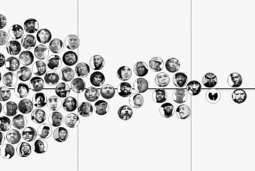
Data, data, everywhere. But what do you do with it? Today, we’ve collected 12 stunning examples of data visualizations in website design to jump-start your thinking about how to work with data.

We live in a time where the ability to showcase data in new and interesting ways can be a huge asset as a designer.

Whether you have a massive collection of numbers or just information that you want to showcase, this design style can be a great tool in your kit.

10 Unique + Innovative Website Layout Ideas

Layouts / 27 Feb 2019

10 Unique + Innovative Website Layout Ideas

The idea has been floating around for a while – web design has a sameness that’s just kind of boring. Let’s dive into some unique and innovative website layouts that can break the mold!

Blame user patterns, too many projects for too few designers, or just the desire of clients to have their site looks like something they’ve already seen and understand. But all is not lost. Even though some people are snoozing at what’s out there, designers are still experimenting and having fun with website design.

Today, we’ll break the routine and dive into ten website designs that feature unique or innovative ideas. If nothing else, it should break you out of any creative rut you might be having.

Minimalist Graphic Design: 10 Examples & Tips

Minimalist Graphic Design / 24 Oct 2018

Minimalist Graphic Design: 10 Examples & Tips

Minimalist design is simple. But it is not boring. Just because a minimal style design often lacks some of the embellishments or color palettes or crazy typefaces in other projects, doesn’t mean it isn’t great to look at. In fact, designs featuring minimalism can be some of the most beautiful and usable websites around.

And even though minimalism is a design style of itself, what types of elements show up in these projects and how they are used tend to change over time. You might call them minimalism trends. Here’s a look at 10 tips for creating a modern minimalist graphic design with examples.

15 Tips for Designing Terrific Tables

CSS / 22 Aug 2018

15 Tips for Designing Terrific Tables

Tables of information are boring. In a sense, they’re meant to be that way. A good table communicates a lot of information in a concise, easy to understand way. Because the emphasis really should be on the information, over-designing a table can kill the effectiveness. However, in the right hands, clever design can not only make a table more attractive but can actually increase readability.

Today we’ll take a look at several ways you can improve the functionality and aesthetics of your tables. One of the most common places we currently find tables online is on a web app’s pricing page so most of our examples will take this form, just keep in mind that these principles can apply to any type of informative grid (whether or not it’s actually a table).

7 Tips for Designing a Large Footer

Layouts / 28 Jun 2018

7 Tips for Designing a Large Footer

Not all website footers are made equal. While footer design might not be a sexy part of the web design process, a great footer can help users find information, contact you, and better engage with a website. Here’s how you design one that’s functional, and beautiful.

A large footer can also help organize information and make navigating a complicated website that much easier – think about the massive, multi-layer footer on Amazon’s website.

The trick to a large footer is content organization. Once you figure out what the footer design should help users do, it is easier to design a bottom-of-the-page element that you can be proud of. Let’s dive into some footer design tips.

10 Tips for Using Text Effects That Don’t Suck

Typography / 30 Apr 2018

10 Tips for Using Text Effects That Don’t Suck

Adding effects to typography can be a source of heartache for designers. Clients demand a drop shadow or embossing, and you’re stuck with text effects that threaten to ruin a project. What you need is an arsenal of text effects that don’t suck so you can help the client pivot to something a little more classy.

The trick to all of these effects is using them with purpose. Good typography doesn’t need “help.” If a font isn’t working alone, it’s not going to work with a bunch of techniques added either. (You’ll only make something bad even worse.)

The best text effects are nearly invisible to non-designers. Or text effects are used to add meaning to typography or lettering. Here are a few tips for using text effects that don’t suck with some pretty cool examples.

The 3 Cs of User Interfaces: Color, Contrast, and Content

Web Standards / 7 Feb 2018

The 3 Cs of User Interfaces: Color, Contrast, and Content

There’s an old business model that many business strategists live by—the 3 Cs. It’s a reminder to focus on the company, customers and competitors. Many small businesses and websites also use this model. But for designers, the three Cs are a little different.

When creating user interfaces, you should focus on color, contrast, and content. These three elements are the foundation of good design. But each is a little more complex than it might seem from the surface. Here’s how to think about–and incorporate–the three Cs of user interfaces into your design projects.

5 Tips for Creating a Memorable Logo Design

How to Design a Logo / 2 Oct 2017

5 Tips for Creating a Memorable Logo Design

A logo might be the single most important visual connection a brand makes with users. It identifies the company or organization and sets a basic tone for interactions with users.

From color to shape to words, every element in a logo design says something. (That’s why such a small element is so important to your brand.)

Logo design takes a lot of planning and thought and it is important to create a mark that represents your business and is something that users can identify and remember. It’s doubtful that you’ll develop the next Nike swoosh, but with the right approach you can create a memorable logo design.

10 Simple Steps to Refresh Your Instagram Account

Instagram Templates / 6 Sep 2017

10 Simple Steps to Refresh Your Instagram Account

Taylor Swift did it. She deleted her Instagram account before re-emerging with a newly refreshed persona. The tactic was part of a campaign for her new album release, but shows a good point: sometimes your accounts just need a refresh.

You can learn more about how Swift did it, or take on a personal challenge to refresh your Instagram account. It’s easier than you might think. (Once you get over the mental block of changing the way you post photos, anyway.)

Here’s how you can refresh your Instagram account in 10 simple steps (and maybe even feel as diva as Taylor Swift in the process).

10 Great Google Font Combinations You Can Copy

Google Fonts / 13 Jul 2017

10 Great Google Font Combinations You Can Copy

The average man considers which flavor of Doritos will taste good with his Heineken. The sophisticated man considers which cheese will pair well with his choice of wine. The designer of course considers which two fonts will look great on the same page.

Today we’re going to use the Google Font API as a playground for mixing fonts and finding ideal pairings. You’ll be able to skim through and instantly grab out selections that you think are appropriate for your projects.

The best part? You need only to copy and paste our code to implement these fonts on your site. It’s completely free and there are no downloads required.

Flat Design: An Evolving Trend

Graphics / 14 Jun 2017

Flat Design: An Evolving Trend

Is the flat design trend finished? We don’t think so. It’s not dead yet. But the trend has evolved to be less stark and more engaging for users.

The early days of flat design were marked by a complete lack of design elements such as shadows, gradients, or realistic elements with texture. Many of those design elements are back, but are being paired with the overall idea of flat design to create a website user experience that’s both simple and easy to engage with. Depending on what side you are on, it might be a better version of flat design.

Here’s a look at the flat design trend evolution, and where we are today.

Design Trend: Experimental Navigation Patterns

Layouts / 22 Mar 2017

Design Trend: Experimental Navigation Patterns

Long gone is the idea that navigation menus must be fixed at the top of a website design. While many designers opt for the safe, consistency of all caps navigation across the top of the screen with sans serif typography, more designs are breaking out of this pattern.

Experimental navigation patterns can be fun and interesting if they are intuitive enough for users to understand reasonably quickly. Different navigation styles can add interest to websites that are small, don’t have a lot of content or want users to move around in a specific way.

While experimental navigation isn’t for every design, it can be a fun alternative for the right project.