Search Results For: design

Designing Without Images: Making Typography Work for You

Inspiration / 16 Mar 2015

Designing Without Images: Making Typography Work for You

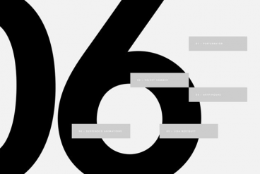
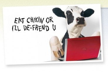
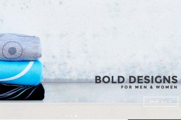
You don’t need a great image for every design project. In fact, you can create a great design with no images at all. It’s a trend that is gaining a lot of momentum as typography-focused projects can be used to stand out against a crowded sea of hero images, video and animations.

All you have to do is think like a typographer. Designing without images takes focus, vision and a clear understanding of design and typography principles to create a piece of art that is totally comprised of text.

10 Tips for Designing Icons That Don’t Suck

Graphics / 12 Mar 2015

10 Tips for Designing Icons That Don’t Suck

Almost every designer is thinking about app design these days. One of the smallest features of every app is the icon used to represent it on the screen of every mobile device and in the app stores. Designing a great icon is more than just putting a logo in a box. You need something that stands out among all the other app icons out there.

A good icon can be used in a variety of ways – for apps, social media and even on smaller printed projects or business cards. And all it takes is a little design and planning.

Google Material Design: Everything You Need to Know

UX Design / 24 Feb 2015

Google Material Design: Everything You Need to Know

You probably keep hearing the phrase “material design” popping up in conversations. The concept is pretty new; it was introduced in the summer and references a new design language from the folks at Google.

But material design is more than just an idea; it is likely to cause designers to completely rethink web and app design processes. Sites are already beginning to role out design schemes using Google’s material design documentation. So now is the time to learn what it’s all about and if a material design framework is in your future.

Minimal Design: How to Design More With Less

Minimalist Graphic Design / 23 Feb 2015

Minimal Design: How to Design More With Less

Minimalism and the use of whitespace are big design trends right now. Mastery of these techniques might look easy at first glance, but it is actually quite difficult to design with so much open space and so few objects. It can be hard for clients to come to terms with because they often want as much information as possible on a canvas.

But many designers like the look of minimal styles and maximizing whitespace can be a fun challenge. It’s a technique that translates well across mediums and can be used in print, web design and on packaging. Here, we’ll look at the trend and how to design more with less.

6 Tips for Designing Signs and Billboards

Graphics / 16 Feb 2015

6 Tips for Designing Signs and Billboards

Your next project assignment: designing a sign for an upcoming event. It will be displayed on billboards around town and printed on smaller yard signs as well. If you are already panicking at the idea, don’t worry — designing a sign is not much different than any other project.

The big difference is scale. It’s going to be a lot larger in size than what you might be used to. Other things to think about when designing signage are location, color, typography, contrast and material the sign will be printed on. Thinking about each of these factors in advance can make for a better sign design experience.

10 Tips for Designing Static Ads

Graphics / 21 Jan 2015

10 Tips for Designing Static Ads

Designing the perfect static ad is no easy feat. It might even be impossible. Designing ads can go against many of the things you think as a designer. Many companies want to cram as much information into a space as possible and many users put up roadblocks when it comes to viewing ads.

The catch is creating something that people want to interact with, despite the fact that it’s an ad. The advantage of a static ad is that is seems less obtrusive than some animated, audio or video options. They also have a classic style about them that makes designing fun. Here are 10 tips for creating an ad that people will look at, with some ads as they actually appear on popular websites.

Designing for the Interstitial Experience

UX Design / 5 Jan 2015

Designing for the Interstitial Experience

Yes. Those little pop-ups matter, and are starting to matter more every day. Interstitial space – and content for it – is becoming an increasingly popular part of designing for the web. From ads, to forms, to bits of information, the interstitial experience is a vital part of the design process.

The dilemma for designers is to create something that users want to look at and not feel annoyed by. Here we’ll work to gain a better understanding of interstitial space and how you can work within it well.

Designing Hover Styles and the Future of the Technique

UX Design / 24 Dec 2014

Designing Hover Styles and the Future of the Technique

Despite arguments that hover styles are dead, these small boxes that pop-up over images, text or other elements on websites are still found all over the web. Designers like them for an added bit of style and information; users like them for functionality. (They are only “dead” because hover styles don’t work without a mouse-over).

The UI function is still there for now. And if you opt to use it, you’ll want to create well-designed hover styles that engage users. You’ll also want to think about how to alter these areas of your website for responsive sites.

How to Balance Text and Visual Content in Design

Layouts / 22 Dec 2014

How to Balance Text and Visual Content in Design

We’ve all heard the phrase “sex sells” but when it comes to design, what does the selling? Text or images? The reality is that both are essential parts of almost every design project. What makes the difference between a project that works and one that falls short is striking the right balance between the two.

While visuals are often processed faster, text can provide greater understanding. Creating balance between text and visual content is a combination of understanding your project and the best method of delivery for content, audience expectation, weighting of elements and delivery.

7 Tips for Designing a Better Checkout Page

Graphics / 26 Nov 2014

7 Tips for Designing a Better Checkout Page

With the holiday season right around the corner, many of us will be doing some shopping online. (OK… maybe a lot of shopping!) The checkout page of a website can make that experience one to remember, or one you wish you could forget.

If you are designing a checkout page, there are so many considerations – functionality, usability, security and design. The last element is something every designer can have impact on. A checkout page should not be designed as an afterthought; it is arguably the most important page in the online shopping experience.

Website Design for Kids: Tips and Advice

Graphics / 24 Nov 2014

Website Design for Kids: Tips and Advice

Designing a project for children is a rather common assignment. From websites to packaging to other images, creating something that is kid-friendly will likely be asked of most designers at some point. But how can you make something kids and adults will appreciate?

That’s the real trick. Kids and adults have to feel engaged by what they are seeing. There are some things that you can do in the design process. Consider elements such as color, typography, gamification, language, animation, storyline and age group for the best success. Today we’re offering some advice and insight into this very topic!

The Designer’s Guide to Visual Punctuation

Graphics / 3 Nov 2014

The Designer’s Guide to Visual Punctuation

Punctuation is more than just periods and exclamation points. In terms of design, punctuation can be anything that causes a reader or user to stop or pause. It can happen while reading text or as the eye moves from one element to another. These bits of visual punctuation are everywhere and are vital parts of any design concept.

The key elements of visual punctuation include common readable punctuation marks as well as space, lines, rules, icons and color.