After Effects Templates / 19 Aug 2019
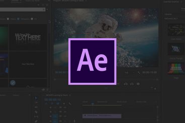
What Is Adobe After Effects (And What Is It Used For?)
Adobe After Effects is a video and animation-based tool that’s used to add elements to moving pictures and animations. Most designers use it to create titles, intros, and transition between clips for more seamless video production.
After Effects is part of the Adobe Creative Suite of products and is included in cloud plans. Full suite users already have access to this tool, or you can get it on its own if that’s all you need.
As with other Adobe tools, the great thing about using this set of tools is that functions and interacts have a look and feel that you are probably already used to, making it easier to learn on the fly.
Here’s a look at Adobe After Effects, what it is, and how to know if you should use it for projects.