CSS / 18 Oct 2013
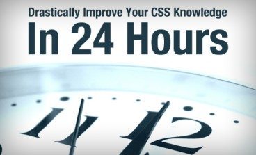
5 Steps to Drastically Improve Your CSS Knowledge in 24 Hours
You’ve been coding for a while now and know your way around a CSS file. You’re certainly no master, but with enough fiddling you can get where you want to go. You’re wondering though if you’ll ever get past that point where CSS is such a struggle. Will you ever be able to bust out a complex layout without ultimately resorting to trial and error to see what works and what doesn’t?
The good news is that you can indeed get past that frustrating point where you know enough CSS to code a website, but lack the solid foundation that allows you to code without the annoyance of not exactly understanding how you’re going to get where you’re going, and this point is a lot closer than you think. I propose that there are five topics that will drastically boost your understanding of CSS. Spend some time reading about each over the next twenty-four hours and you’ll change the way you code forever.