Search Results For: style

7 Tips for Designing a Large Footer

Layouts / 28 Jun 2018

7 Tips for Designing a Large Footer

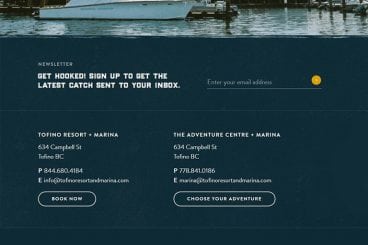
Not all website footers are made equal. While footer design might not be a sexy part of the web design process, a great footer can help users find information, contact you, and better engage with a website. Here’s how you design one that’s functional, and beautiful.

A large footer can also help organize information and make navigating a complicated website that much easier – think about the massive, multi-layer footer on Amazon’s website.

The trick to a large footer is content organization. Once you figure out what the footer design should help users do, it is easier to design a bottom-of-the-page element that you can be proud of. Let’s dive into some footer design tips.

Wedding Monogram Logo Ideas, Tips & Advice

Wedding Design / 4 Jun 2018

Wedding Monogram Logo Ideas, Tips & Advice

A classic wedding monogram is a design element that almost any couple can incorporate into their wedding design and stationery. From use in invitations and mailings to a shared post-nuptial monogram, creating a classy wedding logo or monogram element can be a great touch.

Here are a few tips to help you make your own wedding logo or monogram including templates, ideas, and graphics to help you get started fast.

10 Tips for Using Text Effects That Don’t Suck

Typography / 30 Apr 2018

10 Tips for Using Text Effects That Don’t Suck

Adding effects to typography can be a source of heartache for designers. Clients demand a drop shadow or embossing, and you’re stuck with text effects that threaten to ruin a project. What you need is an arsenal of text effects that don’t suck so you can help the client pivot to something a little more classy.

The trick to all of these effects is using them with purpose. Good typography doesn’t need “help.” If a font isn’t working alone, it’s not going to work with a bunch of techniques added either. (You’ll only make something bad even worse.)

The best text effects are nearly invisible to non-designers. Or text effects are used to add meaning to typography or lettering. Here are a few tips for using text effects that don’t suck with some pretty cool examples.

10 Examples of Timeless Apple Design

Inspiration / 25 Apr 2018

10 Examples of Timeless Apple Design

When we set out to create a list of ten historic Apple products that feature timeless design, it seemed a little daunting. The reality is that it was anything but.

Apple has been at the forefront of design and product design innovation since the Apple I in 1976. (Yes, Apple really has been making computers for 40-plus years.) There are so many products and designs that continue to shape the way we think about creating things today. Wikipedia has a pretty impressive timeline that shows every release – good and bad.

Let’s take a look at ten of our favorite examples that stand the test of time!

10 Tips for a Perfect Facebook Cover Image

Graphics / 18 Apr 2018

10 Tips for a Perfect Facebook Cover Image

Almost every business and individual – from personal pages to freelance business pages – uses Facebook. It’s likely an integral part of your marketing strategy. It might even be your main professional website.

So it is important that you make the most of this platform to ensure that your social media profile is polished and professional. A sloppy image, bad crop, or text that scales improperly can give the wrong first impression. Here are 10 tips for creating a perfect Facebook cover image that people will want to click.

7 Tips for Finding the Perfect PowerPoint Presentation Template

PowerPoint Templates / 11 Apr 2018

7 Tips for Finding the Perfect PowerPoint Presentation Template

A great PowerPoint presentation template can wow audiences, and help you to build a slideshow quickly and easily. While you can create your own custom template, there’s a whole market of affordable PowerPoint templates that you can customize. But what should you be considering when deciding which one to choose?

PowerPoint templates are a great option for designers – or practically anyone – who wants to create a polished, professional-looking presentation that doesn’t take a lot of time to put together. Here’s what to look for to ensure that you are getting the perfect PowerPoint template for each specific presentation.

10 Design Tips for Wedding Cards & Invitations

Wedding Design / 2 Apr 2018

10 Design Tips for Wedding Cards & Invitations

Wedding season is here. Whether you’re planning to design invitations and cards for your own wedding, or for a client or a friend, there are several wedding card design tips that you’ll want to consider!

Wedding invitations present an opportunity to work with some beautiful elements and printing techniques to create a piece of art that isn’t part of the usual workflow. From scripts with long tails to foiling and amazing paper stocks, designing wedding cards and invitations can be a lot of fun (and a bit of a design challenge).

The big thing to keep in mind is that the invitation should evoke an emotional connection to the couple. It should reflect their personality and style.

20+ Awesome Resources for Bootstrap Lovers

Bootstrap / 22 Mar 2018

20+ Awesome Resources for Bootstrap Lovers

Bootstrap has simply exploded in the web development community. There will always be skeptics and haters but on the whole, the project has been a smashing success and can constantly be seen at the top of the Forked and Watched charts at GitHub.

As a result of Bootstrap’s fame, lots of great related resources have been put forth by the development community. Today we’ve collected our favorites into a list of everything you need to get started with Bootstrap. From introductory tutorials to wireframing kits and custom generators, there’s something here for every Bootstrap lover.

Serif, Sans, Script & Slab: 4 Font Types Explained

Typography / 5 Mar 2018

Serif, Sans, Script & Slab: 4 Font Types Explained

Always wanted to know the difference between serif, sans, script, and slab fonts? Look no further. Take your typography game to the next level, and quit guessing if certain typefaces or font pairs work together. Back your logic with a little design theory!

Having a better knowledge of fonts and typography can make explaining your choices to clients easier (always a bonus), and will give you more confidence when selecting font pairs. Here’s a primer (or refresher) on four common font types and how to use them in your design projects.

How to Design Readable Content for the Web

Typography / 14 Feb 2018

How to Design Readable Content for the Web

Designing content is more than just making something look great. You have to create a design that people will actually read, and help them engage with the content. Sometimes, that’s easier said than done.

People generally have short attention spans, and you shouldn’t expect them to digest every word on the screen. But you can use certain design techniques and elements to help users read as much as possible.

Every Design Needs Three Levels of Typographic Hierarchy

Typography / 15 Nov 2017

Every Design Needs Three Levels of Typographic Hierarchy

One of the most important elements for people looking at anything you design is the type. It needs to be clear and readable and it should direct users through a design, from most important elements to least.

And that, in a nutshell, explains typography hierarchy. But to really master the art of type, you need to understand how to layer type throughout a design to achieve maximum impact. Read on to learn how to master typography hierarchy and create effective type in every project.

Parallax Effects Compared: 5 Choices to Consider

Layouts / 13 Nov 2017

Parallax Effects Compared: 5 Choices to Consider

Parallax effects remain one of the hottest web design trends. This animated scrolling technique happens when background and foreground move at different speeds while the user scrolls so that there are two independent layers moving at the same time.

This effect can be used for any number of website types and is a fun way to create – and increase – user engagement. The nice thing about parallax effects is that you don’t have to use them on every page of a design; parallax scrolling is a great homepage technique to help drive users to calls to action or other content.

Parallax effects create an element of depth and distance and a greater sense three-dimension than some other techniques, making users feel like part of the design.

The downside to parallax effects is that they don’t always work on mobile devices. (But there are some workarounds for that as well in the tutorial at the end of this article.)

Here are five parallax effects and styles to consider. (Make sure to click through the links to see exactly how each animation works.)