UX Design / 6 Feb 2017
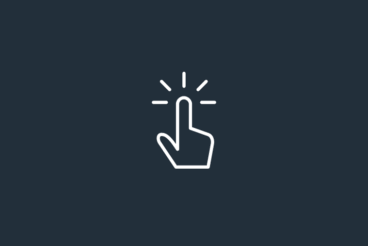
How to Design One-Tap Microinteractions
Microinteractions are the “secret sauce” that make apps and websites shine for users. These tiny details make it easy to set an alarm, press a button or simply better understand how to work with a digital product.
The secret is that the best microinteractions are elements that the user probably doesn’t even think about. They happen in an instant – often with just one tap on a mobile screen. Despite the small nature of the interaction, hence “micro,” the value is immense to users as these engagements become more integrated with daily activity.
How do you design one-tap microinteractions that will delight users? Here are a few ideas.