Search Results For: text

25+ Best Floral & Flower Background Textures 2025

Background Textures / 15 Oct 2021

25+ Best Floral & Flower Background Textures 2025

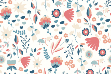
When it comes to designing wedding invitations and greeting cards, a floral background is a must-have flourish that helps you bring out the beauty in your designs. In this collection, we bring you some of the best floral and flower backgrounds you can use with such special design projects.

A background surrounded with beautiful flowers is not just a great way to make your designs look prettier but it’s also an effective way to present your creative designs like fonts, logos, and even to use with PowerPoint presentations.

We handpicked these floral and flower backgrounds with various styles and designs so that you can use them with different types of wedding invitations, greeting cards, blog headers, presentations, and social media post designs. See if you can find a background for your next project.

20+ Best Vintage Textures, Patterns, & Backgrounds (Free & Premium)

Background Textures / 4 May 2021

20+ Best Vintage Textures, Patterns, & Backgrounds (Free & Premium)

Every vintage design needs the right combination of vintage patterns, textures, fonts, and backgrounds to create the atmosphere. You can’t create that timeless vintage look without them.

In this article, we’ll help you find everything you need for crafting more professional vintage designs. We handpicked a collection of vintage textures, patterns, and backgrounds you can use with various types of digital and print designs.

Be sure to download all these resources and keep them saved for later. Thanks to the Envato Elements subscription, you can download everything for a single price. Of course, there are a few free downloads on the list as well. Have a look.

Design Trend: Strong Hero Images With Subtle Text

Trends / 14 Jul 2020

Design Trend: Strong Hero Images With Subtle Text

This website design trend is all about contrast… or the lack thereof. More designs are popping up that have large and stunning hero image areas, but text elements are much more subtle. This is a shift from oversized hero area text that has been big (literally) for some time.

These designs make you look because of this difference. It establishes a sense of contrast with other websites, while maybe not creating so much contrast in the design itself.

Let’s take a look at websites with strong hero images and subtle text to help you generate inspiration for your next project.

How to Add Text to a Video Online: 7 Tips & Tricks

Graphics / 3 Jun 2020

How to Add Text to a Video Online: 7 Tips & Tricks

Everywhere you look in web design, the hero image seems to be replaced with a hero video. And many of these videos include some type of text elements to provide additional information that draws you into the design.

When done right, the result can be rather stunning. When done wrong, video and text elements fall short of conveying a proper message.

Here, we’re going to look at how to ensure your video and text combinations are understandable, readable, and functional in your next design project.

Let’s dive into our assessment of how to add text to a video online, and the rules you should aim to follow as you do so!

Inner Shadows in CSS: Images, Text and Beyond

CSS / 10 Jul 2019

Inner Shadows in CSS: Images, Text and Beyond

Shadows in CSS are quick and easy, whether you’re slapping on a box-shadow or a text-shadow. But how comfortable are you with inner shadows? Can you pull off an inset box-shadow? How do you do the same thing on some text?

Today we’re going to learn some really simple inset shadow techniques that you can pull off with just a few lines of code. I’ll walk you through both the box-shadow and text-shadow syntax and how to change them to pull off an inset shadows.

Is Your Website Font Size Too Small? Large Text Is In

Typography / 3 Sep 2018

Is Your Website Font Size Too Small? Large Text Is In

The standards for typography on the web have shifted. Designers are going with bigger, easier to read typography that is more seamless and consistent across devices. The trend toward bigger web typography started with oversized treatments above the scroll, from headlines to more artistic hero header text elements.

Body text sizes concurrently started to increase on mobile devices to enhance readability. And from there, the trend started to trickle down to almost all aspects of web type. If you haven’t thought about the size of copy on your website recently, it’s time to revisit that 12 or 14-point/pixel body copy. Large text is in!

Design Trend: Sliced Text & Typography

Trends / 11 Jun 2018

Design Trend: Sliced Text & Typography

Purists say that you should never alter typography. Lettering should appear as intended by the type designer, or you should select a different font altogether. While this is mostly true, the exception is in the sliced text trend.

The nifty effect makes type elements look like they’ve been cut with a precision tool and can add visual interest to logotypes, headlines and simple text blocks. Sliced text effects can vary from super subtle (such as a small bit of a letter that’s missing) to major parts of words missing altogether.

The thing to keep in mind when using sliced text is that words must always be readable – what point is there otherwise? – and you should pay close attention so that unintended letter combinations or words don’t appear due to slicing. Here’s a look at how to make it work for you with some examples of designs that do it well.

10 Tips for Using Text Effects That Don’t Suck

Typography / 30 Apr 2018

10 Tips for Using Text Effects That Don’t Suck

Adding effects to typography can be a source of heartache for designers. Clients demand a drop shadow or embossing, and you’re stuck with text effects that threaten to ruin a project. What you need is an arsenal of text effects that don’t suck so you can help the client pivot to something a little more classy.

The trick to all of these effects is using them with purpose. Good typography doesn’t need “help.” If a font isn’t working alone, it’s not going to work with a bunch of techniques added either. (You’ll only make something bad even worse.)

The best text effects are nearly invisible to non-designers. Or text effects are used to add meaning to typography or lettering. Here are a few tips for using text effects that don’t suck with some pretty cool examples.

Tiny Text: 6 Ways to Use It Effectively in Web Design

Typography / 24 Jul 2017

Tiny Text: 6 Ways to Use It Effectively in Web Design

One of the biggest trends in web design right now is super small. “Tiny” text elements have become a popular idea, but it’s a design trend that has spurred some debate.

There’s no doubt that small text sizes can cause some readability concerns. But when done well, a small block of tiny text can actually help create a point of visual emphasis and draw users into certain parts of the design.

Join us as we take a look at the tiny text trend, with examples to provide some design inspiration.

12 Fun CSS Text Shadows You Can Copy and Paste

CSS / 19 Jul 2017

12 Fun CSS Text Shadows You Can Copy and Paste

Typography is everyone’s favorite toy in web design. One particularly fun tool that CSS gives you to play with your type is text-shadow, which seems simple enough at first but can be used to create some remarkable effects with a little ingenuity and creativity.

Today we’re going to run through several text-shadow examples that you can copy and paste for your own work.

How to Balance Text and Visual Content in Design

Layouts / 22 Dec 2014

How to Balance Text and Visual Content in Design

We’ve all heard the phrase “sex sells” but when it comes to design, what does the selling? Text or images? The reality is that both are essential parts of almost every design project. What makes the difference between a project that works and one that falls short is striking the right balance between the two.

While visuals are often processed faster, text can provide greater understanding. Creating balance between text and visual content is a combination of understanding your project and the best method of delivery for content, audience expectation, weighting of elements and delivery.

Generating Placeholder Content in Sublime Text 2

Software / 7 Jan 2013

Generating Placeholder Content in Sublime Text 2

Everyone needs a little placeholder content now and then. Whether it’s a quick dummy image or a chunk of lorem ipsum, placeholder content can help fill the void when you need to flesh out a project but don’t necessarily have your pieces in place.

Today we’re going to take a look at how Sublime Text 2 can help you generate placeholder content automatically so you can save time and move on to the important stuff. Let’s check it out!