Typography / 31 May 2017
Color Fonts: A Beginner’s Guide
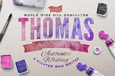
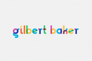
So what in the heck is a color font? It’s a term that keeps popping up and is starting to gain traction, although use in large design projects is still in its infancy.
Vendors such as Adobe’s Typekit have started to release some color font options with browser support, so there’s some movement toward wider use. Some have even called color fonts “the next big thing in web design.”
Here, we’ll look at the trend and let you decide how big – or not – this concept will be.