Business / 4 Oct 2021
Conceptual Design: The Tool You Need to Ideate Like a Pro
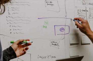
How does the design process start for you? If you want to take ideation and creation to another level, conceptual design may be the place to start.
Conceptual design can actually help you better design an idea so that when you start the process of creation, it is more developed and functional. It’s a great starting point for any project, and can help you lay a solid foundation on which to build.
Here, we’ll walk through conceptual design and how you can use it to ideate and create more effectively.