Reviews / 2 Jul 2015
Power-Up WordPress With the Bridge Multi-Purpose Theme
Whether you’re a beginner or expert when it comes to building and working with websites, WordPress is a great option as a framework and content management system. Pair it with a great theme and you can get a site up and running in to time with a level of customization that works for your project.
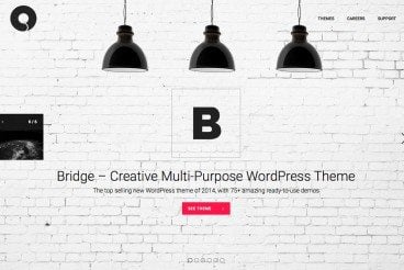
Today, we’re going to take a look at Qode Themes and how you can use these tools to your advantage when building a website. Qode is one of the top sellers on Envato Market, with plenty of great premium WordPress theme options to choose from, including the popular Bridge Multi-Purpose Theme.