1. Authors
  2. Carrie Cousins

Carrie Cousins

Carrie Cousins

Carrie is a freelance writer with years of experience in web and graphic design. Sports fanatic. Information junkie. Designer. True-believer in karma.

Design for Everyone: Considering Accessibility in Visual Projects

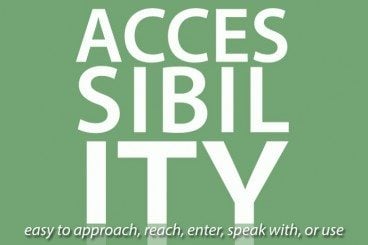
Accessibility / 19 Jun 2014

Design for Everyone: Considering Accessibility in Visual Projects

Because design is such a visual concept, we don’t always stop to think about how design can impact users with certain disabilities. From vision to hearing or even touch impairments, how you design a website, brochure or even package can look or work a different way to different people.

And while you can’t design so that every element is perfect in every condition for every user, there are some things you can do and think about to make your design projects more accessible to a larger number of people. Simple techniques such as color choice, texture, shading and sound effects can make a difference to users.

Design Science: What Is Gestalt Theory?

Inspiration / 18 Jun 2014

Design Science: What Is Gestalt Theory?

If you are like me, it’s been a while since you finished you last formal design class. (And some of us never had any formal design classes.) So a refresher in some of the science behind design seems important. What is gestalt theory and do I really need to understand it?

Today, we’ll focus on one of the guiding principles of design. Gestalt theory is something you likely encounter and use almost every day. But do you understand the theory behind your actions? And how can you make even better use of this concept in your design work?

How to Use Cool Color in Design Projects

Inspiration / 10 Jun 2014

How to Use Cool Color in Design Projects

Cool and warm colors. These descriptions are commonly used to describe hue choices in a variety of conversations – fashion, beauty, decorating and design. But while we commonly talk about warm and cool, do you really know what these terms mean and how to use the colors?

Today, we will look at using cool color in design projects and create a few color palettes with cool hues. (Also make sure to check out the recent Design Shack article featuring warm colors.)

Freelancing 101: Tips for Working From Home

Business / 9 Jun 2014

Freelancing 101: Tips for Working From Home

Working from home can be one of the greatest perks of doing freelance work. It can also lead to the most distractions and enable procrastination. (How many times have you taken the dog for a walk when a project deadline looms?)

You can create a more conducive home workspace that actually encourages you to get things done. Working from home can be an easy, and enjoyable, part of your freelance life if you set yourself up to be productive, happy and avoid home place distractions. Here are 10 ways you can help yourself when it comes to working from home.

How to Use Warm Color in Design Projects

Inspiration / 2 Jun 2014

How to Use Warm Color in Design Projects

Warm and cool colors. These descriptions are commonly used to describe hue choices in a variety of conversations – fashion, beauty, decorating and design. But while we commonly talk about warm and cool, do you really know what these terms mean and how to use the colors?

Today, we will look at using warm color in design projects and create a few color palettes with warm hues. We’ll also investigate the theory and meaning behind different choices.

10 Key Features of an ‘About’ Page

Business / 26 May 2014

10 Key Features of an ‘About’ Page

A great About Us page can make — or even break — your website. For many businesses this can be one of the most visited pages on your website and is a chance for visitors to learn about you and your products.

About Us pages need to be written in clear and simple language and should not be put together as an afterthought. Just like any other page on your site, develop a plan for what message this page should communicate and work from there. Most great About Us pages contain many common elements. Here are 10 things your About Us page needs to include (in no particular order!)

GridGum Theme Marketplace Is Open for Business

Software / 21 May 2014

GridGum Theme Marketplace Is Open for Business

The GridGum launch is official. We first told you about the new responsive themes marketplace in April. And now that the shop is open, you can go see for yourself what it’s all about.

GridGum is a marketplace for only responsive, and highly vetted, themes for a variety of platforms. From Bootstrap to Foundation to Gumby or Skeleton to WordPress or Joomla, you can find a theme for almost any site through GridGum.

5 Tips for Creating a Fun Summer Color Palette

Inspiration / 19 May 2014

5 Tips for Creating a Fun Summer Color Palette

The official start of summer is just around the corner. Longer days, warmer temperatures and splashing in the lake or pool are just a few of the things that come with the change in season. When it comes to design, a change in seasons can create the urge to update your color palette as well.

With warmer days, warmer colors, brighter hues and even the use of more color are popular. And while you may not want to change the color scheme of an existing project — although you can – this season can be a great inspiration for designing a project with a summer-inspired color palette. Here are five tips for creating a great color palette with a few swatches to try based on each concept. Happy summer!

Freelancing 101: How Do I Promote Myself Without Looking Sleazy?

Business / 12 May 2014

Freelancing 101: How Do I Promote Myself Without Looking Sleazy?

One of the toughest things about working as a freelancer can be getting your name out there. How do you connect with the right clients? How can you help those companies find you and your work? And how can you do it without feeling sleazy?

It can be a tough balance. But there are ways to do it. With the right mix of marketing, promotion and word of mouth – and a few design tools – you can find potential clients and feel good about it.

Horizontal Harmony in Design: Keep It Between the Lines

Layouts / 6 May 2014

Horizontal Harmony in Design: Keep It Between the Lines

Horizontal harmony. It’s one of those things that you seem to only notice when it is missing. Horizontal harmony is the relationship between elements across a design. It’s more than lines and rules; it’s also an invisible grid creates a sense of place for design elements.

How can you create horizontal harmony? While some techniques are easier than others, it is not an overwhelming concept. It just takes a little planning. By thinking about things such as a baseline grid, space between lines of text, positioning of elements and the overall aesthetic, horizontal harmony is just part of the design process.

How to Send a Great Email Newsletter on a Budget

Business / 28 Apr 2014

How to Send a Great Email Newsletter on a Budget

It seems like everyone has an email newsletter these days. From design, to maintaining subscribers, to clicking “send,” it can be expensive. But you can send a great newsletter on a budget.

It just requires a little planning. By doing some of the customizations and legwork yourself, you can create a great email marketing list and send a newsletter with a stellar design without handing over big money.

The Complete Guide to Special Characters

Typography / 21 Apr 2014

The Complete Guide to Special Characters

Not everything is as easy as ABC or 123. Sometimes your copy might require a character outside of the basic alphabet. That’s where special characters and glyphs come in. (Look around, they are more common than you might think at first.)

Depending on your workflow, inserting a glyph can be as simple as a keystroke or a multi-step process. Much of it depends on the software you are using, typography palette and how the final product will be published. Here, we are going to take a look at special characters, examples of use and tips for success.