1. Authors
  2. Joshua Johnson

Joshua Johnson

Joshua Johnson

Equal parts editor, writer, designer, and photographer. Hit me up on Twitter, or check out my photos.

The Master Guide to the Photoshop Layers Panel

Software / 10 Sep 2012

The Master Guide to the Photoshop Layers Panel

The Layers Panel in Photoshop is one of the single most important aspects of the software’s UI. Odds are, you’ve spent a good chunk of your life staring at and interacting with the Layers Panel, but how well do you really know it?

Today we’re going to take a deep dive into what the Layers Panel has to offer and how to make the most of it in your workflow. We’ll learn about everything from keyboard shortcuts to obscure customization features. Whether you’re a beginner or a pro, you’re bound to learn a few new tricks!

Build a Fun Photo Swap Animation With CSS Keyframes

CSS / 5 Sep 2012

Build a Fun Photo Swap Animation With CSS Keyframes

CSS keyframe animations open up a vast range of possibilities for what can be accomplished with CSS. Much more than simple, one-step transitions, keyframes can be used to achieve complex, multi-step animations that are quite impressive.

In today’s project, we’re going to start from scratch and build a stack of two photos that spread out and swap their stacking order when you hover over them. Along the way we’ll learn all about how to wield keyframes like a pro and juggle all of those head-spinning prefixes!
A Beginner’s Guide to Leaner CSS

CSS / 4 Sep 2012

A Beginner’s Guide to Leaner CSS

Don’t repeat yourself (DRY). It’s a simple concept with the ability to completely change the way you write code. If I look back to my early days with CSS though, I don’t think the concept meant much to me. Sure, all right, don’t repeat myself, thanks for the advice. How does that translate to applicable advice though?

Today we’re going to look at the very core concepts for how to rethink the CSS you’ve been writing by trimming the fat and reducing the redundancy. The result will be leaner CSS that’s easier to author and maintain.

Code a Mountain Lion Style Notification Window With CSS

CSS / 3 Sep 2012

Code a Mountain Lion Style Notification Window With CSS

This one is for my fellow Mac nerds. Apple’s newest desktop operating system, OS X Mountain Lion, has a built-in notification system similar to what we’ve had on iOS for years. Today we’re going to build one of the notification windows using CSS.

To pull this off, we’ll use some basic HTML and a little bit of fancy CSS3. To finish it off, we’ll add a touch of jQuery magic to allow the user to drag the window around. It’ll be tons of fun, so boot up your favorite coding app and follow along!

Semantic Grid Class Naming With Placeholder Selectors in Sass 3.2

CSS / 28 Aug 2012

Semantic Grid Class Naming With Placeholder Selectors in Sass 3.2

CSS frameworks are known for taking a club to the idea of semantic HTML. This is such a problem that developers everywhere have entirely sworn off the idea of grid-based frameworks solely on the principle that it leads to non-semantic class names.

With Sass, it becomes quite easy to work around this problem and use a predefined grid without resorting to wonky class names. In fact, the latest version of Sass (3.2) has a new feature that makes this task easier than ever. Read on to see what it is and how it works.

Master Responsive Web Design With Gridset

CSS / 13 Aug 2012

Master Responsive Web Design With Gridset

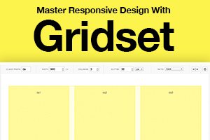
Let’s face it, responsive design is hard work. Web design was difficult enough when we were only considering desktop platforms, but the challenge of seemingly infinitely varying screen and viewport sizes has really added to the complexity of website layout.

Whether you’re completely new to responsive design or consider yourself an expert in the area, the tool that we’re going to look at today will blow you away. It’s called Gridset and it’s amazing.

5 Design Lessons That I Learned From Writing 85 Web Design Critiques

CSS / 9 Aug 2012

5 Design Lessons That I Learned From Writing 85 Web Design Critiques

Here at Design Shack we offer a simple but useful service called a web design critique. It’s basically a consulting service that you can take advantage of for a mad cheap price in exchange for letting us post it on the site as an educational tool.

I’ve personally written up a whopping eighty five of these things thus far (#85 will be posted later this week). That’s a whole lot of design advice! Read on to see what I’ve learned about web design in the process, both from the good examples and the bad.

Which Is Right for Me? 22 Responsive CSS Frameworks and Boilerplates Explained

CSS / 8 Aug 2012

Which Is Right for Me? 22 Responsive CSS Frameworks and Boilerplates Explained

CSS frameworks have been around for years now, but the arrival of responsive design practices has rendered many of our old favorites useless. Fortunately, lots of really talented developers have jumped in to fill the gap with the next generation of CSS frameworks and boilerplates.

There’s already a ton of these things floating around. Everyone has a list, but no one really walks you through how each framework and boilerplate differs from the next so that you can make an informed decision. That’s our goal today. Follow along as we take a look at what makes each of these 22 responsive CSS frameworks and boilerplates unique.

Good Design Taste Test: Three Fast Casual Restaurant Websites Compared

Graphics / 2 Aug 2012

Good Design Taste Test: Three Fast Casual Restaurant Websites Compared

Fast food restaurants are notoriously bad with web design, but the emerging market of “fast casual” eateries thus far is proving to be much better in this area.

Today we’re going to look around the web at the websites for some of the most popular fast casual restaurants to see who is doing the best work and what we can learn from them. Warning: this post will make you hungry!

A Beginner’s Guide to Using Google Web Fonts

Google Fonts / 1 Aug 2012

A Beginner’s Guide to Using Google Web Fonts

When Google Web Fonts was first released, we wrote up a quick walkthrough. Since then, the service has been completely overhauled and it’s high time for a thorough walkthrough from scratch.

Join us as we start at the very beginning and discuss what the Google Web Fonts service is and how to get it up and running on your site today.

Give us a few minutes of your time and we’ll open you up to the awesome world of awesome free web fonts.

How to Turn Photographic Textures Into Masks in Photoshop

Software / 30 Jul 2012

How to Turn Photographic Textures Into Masks in Photoshop

Texture is a key element of design. Learning how to wield and apply textures effectively will really open up your level of skill and proficiency in Photoshop.

Today we’re going to learn about a super quick and easy way to take a photographic texture and turn it into a mask that affects the transparency of a layer. No matter how proficient you are with Photoshop, you should be able to pick up this technique and begin using it on your projects today.

Leveraging Stereotypes in Design: Masculine vs. Feminine Typography

Typography / 19 Jul 2012

Leveraging Stereotypes in Design: Masculine vs. Feminine Typography

Can type have a gender? Is it even socially acceptable to ask such as question? Putting aside any sort of nonsensical gender bias, it’s absolutely the case that typography can and does suggest a level of masculinity (or a lack thereof).

Today, we’re going to jump into what makes a typeface feminine vs. masculine. More importantly, we’ll talk about why this matters and and how it should influence your design work.