Layouts - Page 2

Advice for crafting layouts and structure that can create a clear, original web design. Break the mould, and build a unique layout!

10 Rock Solid Website Layout Examples

Layouts / 26 Jan 2024

10 Rock Solid Website Layout Examples

Layout can both be one of the easiest and one of the trickiest facets of web design. Sometimes a designer can bust out an amazing layout in minutes and sometimes that same designer can struggle for the better part of day with the same task.

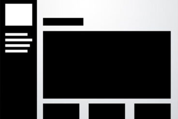
Each project is unique and calls for a unique solution, but I’ve found it helpful to keep a few rock solid and incredibly versatile alignments in mind that I can bust out when I get stuck.

The ten layouts below should be enough to get you through even the worst cases of designer’s block when you can’t figure out the best way to arrange the content on your page.

15+ Creative Website Header Design Examples + Tips

Layouts / 4 Jul 2023

15+ Creative Website Header Design Examples + Tips

The website header, also referred to as the above the fold section, is arguably the most important part of a website. Mainly because it’s the first part of the website visitors see when they arrive on the website.

When it comes to websites, first impressions matter a lot. And the header section plays a major role in it. In fact, according to a study, the majority of website visitors only stay about 15 seconds on a website before they leave.

The header design of your website will play a key role in whether you can convince a visitor to stay longer than 15 seconds.

With the right header design, you can influence visitors to keep browsing the website. You can also design a header in a way that persuades visitors into taking action as well.

To help you find inspiration and learn a few tricks about effective header design, we handpicked some of the best website header design examples for your inspiration. These designs will surely help you make your own headers stand out from the crowd.

How Many Wireframes Do You Need? (Guide to Effective Wireframing)

Layouts / 6 Dec 2021

How Many Wireframes Do You Need? (Guide to Effective Wireframing)

Too often new website design projects start with a little wireframe overload.

Creating dozens of wireframes to show a client at the start of the project doesn’t necessarily create better understanding; it can be downright overwhelming.

Like with many other aspects of design, wireframing is an art where, in many cases, less is more.

Here’s a look at how to wireframe more effectively and a guide to how many wireframes you actually need (plus, some ideas on which ones are the most important, and which you can probably miss!)

How to Design a Captivating Web Questionnaire

Layouts / 17 Jun 2021

How to Design a Captivating Web Questionnaire

We’ve all run across them – web questionnaires or surveys that were so simple and delightful that they were actually fun to fill out.

Sadly, that’s the exception to the rule. More often than, surveys are clunky and cumbersome.

You can design a captivating web questionnaire with the right thought process. It’s a mix of question planning with visual elements and cues to make the process user-friendly and somewhat seamless.

Here’s how you do it.

Vector vs. Raster: What Do I Use?

Layouts / 26 Aug 2020

Vector vs. Raster: What Do I Use?

With all of the image options and file formats out there, it can be a little overwhelming when you are choosing what file type to use (and send to clients). Compatibility is always a concern when you are working with different file types, but when it comes to graphics and images the type of computer graphic format you use is essential to how the image renders.

There are two types of digital graphics files – vector and raster. Vector images are made of hundreds of thousands of tiny lines and curves (or paths) to create an image. Raster images are composed of pixels. But how do you know what format is best for your next project?

10 Unique + Innovative Website Layout Ideas

Layouts / 27 Feb 2019

10 Unique + Innovative Website Layout Ideas

The idea has been floating around for a while – web design has a sameness that’s just kind of boring. Let’s dive into some unique and innovative website layouts that can break the mold!

Blame user patterns, too many projects for too few designers, or just the desire of clients to have their site looks like something they’ve already seen and understand. But all is not lost. Even though some people are snoozing at what’s out there, designers are still experimenting and having fun with website design.

Today, we’ll break the routine and dive into ten website designs that feature unique or innovative ideas. If nothing else, it should break you out of any creative rut you might be having.

7 Tips for Designing a Large Footer

Layouts / 28 Jun 2018

7 Tips for Designing a Large Footer

Not all website footers are made equal. While footer design might not be a sexy part of the web design process, a great footer can help users find information, contact you, and better engage with a website. Here’s how you design one that’s functional, and beautiful.

A large footer can also help organize information and make navigating a complicated website that much easier – think about the massive, multi-layer footer on Amazon’s website.

The trick to a large footer is content organization. Once you figure out what the footer design should help users do, it is easier to design a bottom-of-the-page element that you can be proud of. Let’s dive into some footer design tips.

Parallax Effects Compared: 5 Choices to Consider

Layouts / 13 Nov 2017

Parallax Effects Compared: 5 Choices to Consider

Parallax effects remain one of the hottest web design trends. This animated scrolling technique happens when background and foreground move at different speeds while the user scrolls so that there are two independent layers moving at the same time.

This effect can be used for any number of website types and is a fun way to create – and increase – user engagement. The nice thing about parallax effects is that you don’t have to use them on every page of a design; parallax scrolling is a great homepage technique to help drive users to calls to action or other content.

Parallax effects create an element of depth and distance and a greater sense three-dimension than some other techniques, making users feel like part of the design.

The downside to parallax effects is that they don’t always work on mobile devices. (But there are some workarounds for that as well in the tutorial at the end of this article.)

Here are five parallax effects and styles to consider. (Make sure to click through the links to see exactly how each animation works.)

Coming Soon Landing Pages: Tips and Best Practices

Layouts / 11 Oct 2017

Coming Soon Landing Pages: Tips and Best Practices

What do you do when your website is under construction and you aren’t quite ready for launch?

Whether you’re generating buzz to release a new product or app, or just waiting for a new website project to be ready, a coming soon page can be the fix.

When used well, coming soon pages can help generate leads (with an email signup form) and drum up some interest for your website.

Design Trend: Experimental Navigation Patterns

Layouts / 22 Mar 2017

Design Trend: Experimental Navigation Patterns

Long gone is the idea that navigation menus must be fixed at the top of a website design. While many designers opt for the safe, consistency of all caps navigation across the top of the screen with sans serif typography, more designs are breaking out of this pattern.

Experimental navigation patterns can be fun and interesting if they are intuitive enough for users to understand reasonably quickly. Different navigation styles can add interest to websites that are small, don’t have a lot of content or want users to move around in a specific way.

While experimental navigation isn’t for every design, it can be a fun alternative for the right project.

How to Break the Grid Without Making a Mess

Layouts / 16 Jan 2017

How to Break the Grid Without Making a Mess

A grid is the foundation of almost any website design. These invisible lines help create rhythmic space and visual flow, so each project carries a sense of organization and harmony.

But you don’t have to stick to the grid 100 percent of the time. You can even break the grid from time to time without making a total mess. Here’s how you do it, while still keeping a website that’s a pleasure to use!

How to Design for Long-Form Content

Layouts / 22 Nov 2016

How to Design for Long-Form Content

Forget what you think about user attention spans. Long-form content can be a valuable part of your design strategy (and doesn’t have to be a boring block of ongoing text). Users love a good story and long-form content is a great way to create an immersive and engaging experience.

To keep users interested – and scrolling – you have to design interactions that are visually pleasing and create a consistent experience from the first glimpse to the final act. Here are a few ways to design long-form content that meets those goals with a few examples that are anything but boring.