UX Design - Page 2

Tips for creating designs that give the user a delightful, clear, and well-planned experience with a high-quality UX (user experience).

What Is Rapid Prototyping & Why Use It? (+ 5 Best Tools)

UX Design / 18 May 2021

What Is Rapid Prototyping & Why Use It? (+ 5 Best Tools)

Rapid prototyping is one of the most important segments of the product development process. It’s what ultimately decides how your product will perform and how it will be received by the end-user.

Whether you’re working on a mobile app or website design, rapid prototyping should be part of your project. It will help you avoid catastrophic product launches as well as avoid the embarrassment of delivering a broken design to your clients.

In this guide, we take a quick look at what rapid prototyping is all about and how it can be beneficial for your projects. We’ll also suggest a few great rapid prototyping tools for you to use.
11 Tips for Creating a Usable Website Contact Page

UX Design / 3 Dec 2020

11 Tips for Creating a Usable Website Contact Page

Peek at the analytics. Chances are that your contact page is among the most visited on our website.

It’s for good reason. Visitors will seek out a contact page to get additional information about your company or business, find your location, or get in touch.

Now the bad news. This is an often-neglected part of the website design. Too many websites don’t take care of the contact page, resulting in missed opportunities and conversions.

You can remedy that right now with these tips for creating a usable contact page.

Design Trend: Modern Tappable Targets (And How to Do It)

UX Design / 15 Oct 2020

Design Trend: Modern Tappable Targets (And How to Do It)

A solid tap target can make or break your mobile website or app. The size, shape, location, and overall design of the button or link determines whether a user successfully completes an action or not. It might seem like a small thing, but can be one of the most important elements of a design.

Modern tappable targets are easy to recognize, work in an expected manner, and encourage engagement.

Today we’re looking at how to design them, ways to craft effective call-to-action items, and considerations around color and font choices.

Is Your Design Inclusive? (And How to Make It More Inclusive)

UX Design / 18 Aug 2020

Is Your Design Inclusive? (And How to Make It More Inclusive)

Is your design for everyone? We talk a lot about creating with an audience in mind, but it’s important to understand that audience can identify in several ways.

Now more than ever before, it is important to create designs and visuals that are inclusive of that entire audience segment. An inclusive aesthetic will make users feel like they are part of the design and that a company, organization, or product is for them.

Inclusivity is more than just accessibility. It’s a combination of function and visual design that creates something that people identify with and want to be a part of.

It’s time to check yourself and your designs, put aside your biases and take a hard look at projects to ensure they are as all-encompassing as they can be. Let’s get started.

10 Pros and Cons of Minimal Navigation in Web Design

UX Design / 17 Feb 2020

10 Pros and Cons of Minimal Navigation in Web Design

There’s been a shift happening in website design for a while: navigation and menus are shrinking. Minimal navigation styles and elements are growing in popularity, despite arguments against the hamburger menu icon.

Although not all minimal navigation elements use this style, it’s certainly a visual style we’ve seen explode in use over the past few years.

But does it work? Should you consider using minimal navigation for projects? Here, we’re going to take a look at some pros and cons with examples of use. The answer might not be as simple as you think.

5 Really Useful Responsive Web Design Patterns

UX Design / 30 Jul 2019

5 Really Useful Responsive Web Design Patterns

Responsive web design requires a very different way of thinking about layout that is both challenging and exciting. The art of layout was already complex enough for the centuries that it was defined by fixed elements, now things are becoming exponentially more complicated as layouts become increasingly adaptive.

To help reprogram your brain to consider layouts in new ways, we’re going to take a look at some interesting responsive design patterns that are being implemented by talented designers all over the web.

How to Design a Perfect Website Onboarding Process (With Examples)

UX Design / 5 Jun 2019

How to Design a Perfect Website Onboarding Process (With Examples)

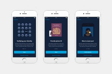
Think about the last time you downloaded a new app or landed on a new website. Did you know exactly what to do? Did the design help you engage with the site in a meaningful way? A simple onboarding process can make all the difference.

It’s important to think about website and app design in terms of onboarding visitors to create the best experience possible. This can include anything from helping someone find an item in your online shop and understanding how to make a purchase, to playing a game, or signing up for an email.

Onboarding is the process of integrating any new user into the design flow so that they can have the best interaction possible with your website, app or digital product or service. Here’s how you design it (with examples for inspiration).

What Are Dark Patterns? (And Why You Shouldn’t Use Them)

UX Design / 28 Jan 2019

What Are Dark Patterns? (And Why You Shouldn’t Use Them)

Dark patterns are website interfaces that cause users to interact with a website in a way that isn’t what they intended. They cause users to click through to a page, or even add an extra item to a shopping cart, without intending to.

From sneaky clicks to straight-up poor website practices, dark patterns are in more places than you might expect. Today, we’ll look at what dark patterns are, how to identify them and why you shouldn’t use this technique in your website or app projects.

If you think a dark pattern is a cute background image, you need to keep reading.

7 Tips for Better Contact Form Design (With Examples)

UX Design / 10 Sep 2018

7 Tips for Better Contact Form Design (With Examples)

Better contact form design starts with usability. The goal of a form is obvious: you need information from the user. The form has to be intuitive enough so users know exactly what to do and don’t get sidetracked in the process of completing that action.

The best contact forms are easy to look at and include highly usable elements that users can engage with without thinking about them. (It sounds a little easier than it is sometimes.) But thankfully, we have a selection of tips to help you design better contact forms.

How to Become a UX Designer

UX Design / 4 Jul 2018

How to Become a UX Designer

So you think you want to be a UX designer? But maybe you don’t know exactly where to start. Whether you are a student thinking about the future, or in the midst of your design career looking to make a change, the process is pretty similar.

If you put in the work and time, you can develop your skills and start doing more UX work. Today we’re exploring what a UX designer does, along with tips, ideas, and suggestions for how to start out on your journey to becoming a UX designer.

Design Inspiration for Scroll Actions

UX Design / 4 Sep 2017

Design Inspiration for Scroll Actions

Scrolling is a key component of any website design that extends beyond a single landing page. Anyone who thinks the scroll is dead needs to jump out of 2005!

Scroll actions move users through content vertically or horizontally and are a commonly accepted user pattern. The scroll is alive and well thanks to plenty of interesting design techniques and a shift toward accessing full websites on smaller screens. Let’s take a look!

Don’t Make These 10 Mistakes in Your App Design

UX Design / 4 Jul 2016

Don’t Make These 10 Mistakes in Your App Design

No matter what type of app you are creating, have created, or plan to create, design mistakes can be lethal when it comes to adoption and usage. Users want to download apps that are fun, functional and offer value during multiple uses. Users also want apps that are aesthetically pleasing and don’t require a lot of effort to interact with.

The problem for designers is that sometimes we are so close to a project that we miss glaring mistakes in design and usability because we know how it works. Today, we’re going to help you make a mental checklist of mistakes to look for and avoid in app design.