Search Results For: graphic design

10 Tips for Awesome Tumblr Theme Design

Tumblr Themes / 16 May 2012

10 Tips for Awesome Tumblr Theme Design

Here at Design Shack, WordPress is our bread and butter, but in the world of blogging platforms, we have lots of love for Tumblr as well. It’s simple, gorgeous, and simply enjoyable to use.

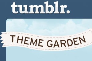
Today we’re going to take a look at what makes a great Tumblr theme. With thousands of options in the Tumblr theme garden, it can be difficult to stand out.

Why do some themes catch so much attention while others are ignored? Good design holds the answer. Not all themes are created equally, and knowing what aesthetic cues to look for can help you choose a Tumblr theme that will serve you well.

200+ Pinterest Boards for Designers to Follow

Inspiration / 11 Apr 2012

200+ Pinterest Boards for Designers to Follow

If you love design inspiration, you should be on Pinterest. This free service has really taken off and designers everywhere are using it to collect and archive examples of great design. Whether you’re a typography nut, need some ideas for design books to read, or want some inspiration for out of the box brochure ideas, there are designers on Pinterest who are no doubt pinning exactly what you’re looking for.

Much like, Twitter, the key to enjoying Pinterest is to find and follow users that share your interests. The trick here is that while every user has multiple “boards,” only some of them are actually design related. We’ve spent hours and hours hunting and have found over two hundred of the best Pinterest boards that designers should find useful. Read on to check them out!

Big Design in Small Spaces

Layouts / 23 Mar 2012

Big Design in Small Spaces

It’s easy to get caught up in the big picture sometimes – what your whole site looks like or the message it conveys. Just as important though, are the small spaces. The look of your banner, sidebars and even the dreaded-in-some-circles above the scroll presentation can bring people into or turn people away from your site.

Effective design in restricted, and even constricted spaces can be the key to adding just the right flair to your site. Simple design tools such as cropping, color, text display and contrast can make all the difference when planning the design for the boxed-in spaces of your next project.

Ready or Not, Here Comes HD Web Design

HTML / 22 Mar 2012

Ready or Not, Here Comes HD Web Design

Apple is pushing the tech industry forward by increasing the pixel density on iPhone and iPad screens. This is great from a user’s perspective, but as a web designer or developer it literally threatens to completely change the way you build websites.

Are you ready for HD web design? Do you know how your sites will look on a new generation of high resolution screens? What steps can you take to prepare yourself and what skills will you need to stay relevant in the years to come? Read on to find out.

Web Design Vocabulary Refresh Part 1: HTML

HTML / 5 Mar 2012

Web Design Vocabulary Refresh Part 1: HTML

What’s the difference between an element and a tag? When should I use strong and when should I use bold? What the heck is the DOM? When you’re new to web design, one of the biggest hurdles to overcome is always the jargon. So many technical terms are thrown around flippantly and rarely explained outright that it’s easy to get lost.

This series will serve as a basic introduction to some terms that every new web designer should be sure to add to his or her vocabulary. This won’t be an exhaustive vocabulary list but rather a primer on a few terms that I found difficult to wrap my head around when I was a beginner. We’ll start with HTML today and move on to CSS in the near future.

Utilizing Grids in Print Design

Layouts / 27 Dec 2011

Utilizing Grids in Print Design

The basic organization of a design project typically begins with a simple concept – the grid. Whether you decide to work within its constraints or intentionally move away from it, deciding how to use a grid tends to be one of the first steps in the design process.

Print designers have been working on grids since the first newspapers rolled off the presses hundreds of years ago. Most magazines also employ a grid; books are put together using the grid format. The grid can be part of a publication’s identity and helps create a sense of space and organization. Understanding the basics of grid design – from how it originated, to developing your own grid and using it in your workflow processes – will make working within vertical and horizontal constraints a snap.

How to Use Synergy to Take Your Designs to the Next Level

Graphics / 26 Dec 2011

How to Use Synergy to Take Your Designs to the Next Level

“Synergy” – In business this is a term that has been so often abused that it has become a meaningless buzzword. Some of you may cringe just at the sound of it.

However, in design synergy is a powerful weapon that, when wielded properly, can make your designs much more interesting and creative. What is synergy? Where can we find some solid examples of synergy in design? How can you use synergy in your work? Read on to find out.

Tips and Ideas for Designing With Blurred Images

Layouts / 15 Dec 2011

Tips and Ideas for Designing With Blurred Images

“The supreme accomplishment is to blur the line between work and play.”
– Arnold Toynbee

The topic of today’s discussion is blurry photos. No, not the kind that you accidentally take because your kids won’t sit still. The intentional kind, the use of which can serve several practical purposes in design.

We’ll learn all about how to use blur effects to help make text more legible, direct the viewer’s attention, and just make backgrounds more fun. We’ll also take a look at some different types of blurs and how to properly apply selective blurring.

Going Global: Leveraging Cultural Dimensions for Better Design

Business / 14 Nov 2011

Going Global: Leveraging Cultural Dimensions for Better Design

The world is a widely varied place and it’s naive to imagine that a design that resonates well with one group of people will be equally effective with another group on the other side of the globe.

Today we’ll show you how to wield Geert Hofstede’s Cultural Dimensions to better tailor your designs to different cultures through a basic understanding of the values that they tend to pursue.

How to Design a Tour Page: Examples and Best Practices

Layouts / 8 Nov 2011

How to Design a Tour Page: Examples and Best Practices

Tour pages are one of the most important components for websites advertising apps and/or services. The tour page is often where interested users will either make the firm decision to sign up or move on to something else.

Needless to say, there’s a lot of pressure as a designer to get this right! Fear not however, many talented designers have gone before you and we can learn a lot by looking at their examples. We’ll dive into tour pages from giants like Mozilla, 37Signals and Mint.com and see what common tricks they all use to win conversions.

Design History: The Art of Playing Cards

Layouts / 7 Nov 2011

Design History: The Art of Playing Cards

Great design inspiration is all around us. Sometimes the best examples are so common that we see them all the time without a second thought. The cars we drive, the advertisements in our mailbox, the cover art on that new album you just downloaded, all of these are teaching their own little design lessons and if we would but listen, we just might learn something.

Today’s subject is playing cards. At least one pack can be found in almost every home in America, which means they’re a perfect example of ubiquitous design that we take for granted. We’ll take a fresh look at why they’re so perfectly designed and learn a little history along the way.

Graphics / 9 Aug 2011

Tips for Designing With Multiple Photos

Photography is one of your most powerful resources as a designer. Here we’ll take a look at some clever and unique ways to create photo-centric designs using multiple images.