Search Results For: look

80s Fonts: A Retro Typographic Trend (+ Examples)

Font Collections / 9 Jul 2018

80s Fonts: A Retro Typographic Trend (+ Examples)

Everything about my childhood seems to be cool again. The Netflix hit Stranger Things seriously evokes feelings of the 1980s, people are buying classic Nintendo game consoles again, and everything 80s is totally rad, even when it comes to design projects.

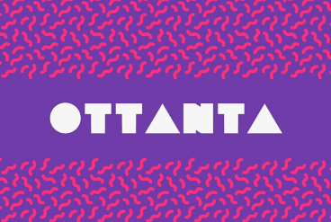
And what makes that 80s connection quickly? It’s typography. This decade definitely had a pretty distinct feel. We’re taking a look at the 80s retro font trend with plenty of great typographic options for your projects.

How to Become a UX Designer

UX Design / 4 Jul 2018

How to Become a UX Designer

So you think you want to be a UX designer? But maybe you don’t know exactly where to start. Whether you are a student thinking about the future, or in the midst of your design career looking to make a change, the process is pretty similar.

If you put in the work and time, you can develop your skills and start doing more UX work. Today we’re exploring what a UX designer does, along with tips, ideas, and suggestions for how to start out on your journey to becoming a UX designer.

7 Tips for Designing a Large Footer

Layouts / 28 Jun 2018

7 Tips for Designing a Large Footer

Not all website footers are made equal. While footer design might not be a sexy part of the web design process, a great footer can help users find information, contact you, and better engage with a website. Here’s how you design one that’s functional, and beautiful.

A large footer can also help organize information and make navigating a complicated website that much easier – think about the massive, multi-layer footer on Amazon’s website.

The trick to a large footer is content organization. Once you figure out what the footer design should help users do, it is easier to design a bottom-of-the-page element that you can be proud of. Let’s dive into some footer design tips.

How to Write a UX Proposal

UX Design / 25 Jun 2018

How to Write a UX Proposal

Did you know that a great UX proposal can solidify client relationships and facilitate project management? Here’s how you write a UX proposal that will help you manage projects, and strengthen client relationships.

A UX proposal is a document that outlines a UX, app or web design project. It should note what the problem is – what the client wants – and how a solution will be developed digitally. The proposal sets an expectation of work, what will get done, and the timeline for milestones and launch. It is the guiding document for the project that developer/designer and client agree on before work starts so that everyone is on the same page.

If you are working without a UX proposal, you might want to make a change to that process right away.

How to Create a Color Palette Without Stressing Out

Graphics / 20 Jun 2018

How to Create a Color Palette Without Stressing Out

Picking the perfect color palette can be a little nerve-wracking. It’s something you’ll be committed to for some time, so you’ll want to get it right! Today we’re looking at how to create a color palette, with plenty of tips and advice.

There are a few things that designers who don’t sweat about color always do (and think about), to help ensure that their palettes will hold up over time. Here are some of their tricks of the trade, so you can create a color palette without stressing out!

5 Reasons to Use a Responsive Mockup Template

Mockup Templates / 13 Jun 2018

5 Reasons to Use a Responsive Mockup Template

If you aren’t using responsive mockup templates to showcase your website and app design projects, you’re missing out! A mockup template provides a realistic or stylized shell to highlight a design, and choosing a responsive template can beautifully show your design’s versatility.

Most designers use a mockup template to place a website design into a computer screen, tablet, or phone to give clients or other stakeholders a preview of what a finished project will look like. The result is polished and easy for users to understand.

If you haven’t ventured into the world of using one of these tools yet, here are five reasons to use a responsive mockup template. All with some great examples to show you exactly how they work.

Design Trend: Sliced Text & Typography

Trends / 11 Jun 2018

Design Trend: Sliced Text & Typography

Purists say that you should never alter typography. Lettering should appear as intended by the type designer, or you should select a different font altogether. While this is mostly true, the exception is in the sliced text trend.

The nifty effect makes type elements look like they’ve been cut with a precision tool and can add visual interest to logotypes, headlines and simple text blocks. Sliced text effects can vary from super subtle (such as a small bit of a letter that’s missing) to major parts of words missing altogether.

The thing to keep in mind when using sliced text is that words must always be readable – what point is there otherwise? – and you should pay close attention so that unintended letter combinations or words don’t appear due to slicing. Here’s a look at how to make it work for you with some examples of designs that do it well.

Wedding Monogram Logo Ideas, Tips & Advice

Wedding Design / 4 Jun 2018

Wedding Monogram Logo Ideas, Tips & Advice

A classic wedding monogram is a design element that almost any couple can incorporate into their wedding design and stationery. From use in invitations and mailings to a shared post-nuptial monogram, creating a classy wedding logo or monogram element can be a great touch.

Here are a few tips to help you make your own wedding logo or monogram including templates, ideas, and graphics to help you get started fast.

27 Inspiring Letterpress Style Posters

Poster Design / 31 May 2018

27 Inspiring Letterpress Style Posters

Are you planning on designing a poster with a retro or a vintage vibe? Not sure where to start? Then browse our hand-picked collection of letterpress posters and letterpress templates to find inspiration.

Letterpress is one of the oldest printing techniques that date back to the early 1440s. Back in the day, this technique was used to easily print many copies of a poster, flyer, and other designs with photo and letter-etched plates.

Even though it’s no longer widely used by printers and publishers, the technique and the unique design style is still celebrated by artists and designers. It’s especially popular among poster designers. In this collection, we’re featuring elegant and modern letterpress poster designs.

10 Tips for Using Text Effects That Don’t Suck

Typography / 30 Apr 2018

10 Tips for Using Text Effects That Don’t Suck

Adding effects to typography can be a source of heartache for designers. Clients demand a drop shadow or embossing, and you’re stuck with text effects that threaten to ruin a project. What you need is an arsenal of text effects that don’t suck so you can help the client pivot to something a little more classy.

The trick to all of these effects is using them with purpose. Good typography doesn’t need “help.” If a font isn’t working alone, it’s not going to work with a bunch of techniques added either. (You’ll only make something bad even worse.)

The best text effects are nearly invisible to non-designers. Or text effects are used to add meaning to typography or lettering. Here are a few tips for using text effects that don’t suck with some pretty cool examples.

10 Examples of Timeless Apple Design

Inspiration / 25 Apr 2018

10 Examples of Timeless Apple Design

When we set out to create a list of ten historic Apple products that feature timeless design, it seemed a little daunting. The reality is that it was anything but.

Apple has been at the forefront of design and product design innovation since the Apple I in 1976. (Yes, Apple really has been making computers for 40-plus years.) There are so many products and designs that continue to shape the way we think about creating things today. Wikipedia has a pretty impressive timeline that shows every release – good and bad.

Let’s take a look at ten of our favorite examples that stand the test of time!

10 Tips for a Perfect Facebook Cover Image

Graphics / 18 Apr 2018

10 Tips for a Perfect Facebook Cover Image

Almost every business and individual – from personal pages to freelance business pages – uses Facebook. It’s likely an integral part of your marketing strategy. It might even be your main professional website.

So it is important that you make the most of this platform to ensure that your social media profile is polished and professional. A sloppy image, bad crop, or text that scales improperly can give the wrong first impression. Here are 10 tips for creating a perfect Facebook cover image that people will want to click.