Layouts / 26 Jan 2024
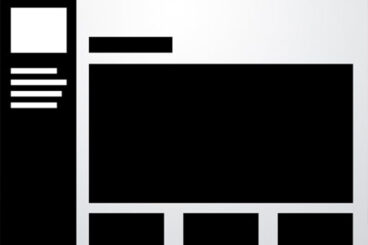
10 Rock Solid Website Layout Examples
Layout can both be one of the easiest and one of the trickiest facets of web design. Sometimes a designer can bust out an amazing layout in minutes and sometimes that same designer can struggle for the better part of day with the same task.
Each project is unique and calls for a unique solution, but I’ve found it helpful to keep a few rock solid and incredibly versatile alignments in mind that I can bust out when I get stuck.
The ten layouts below should be enough to get you through even the worst cases of designer’s block when you can’t figure out the best way to arrange the content on your page.