Layouts / 5 Mar 2026
Why You Should Design Layout Content Blocks Instead of Full Templates
Design has become more fluid, more adaptive, and far more collaborative than it was even a few years ago.
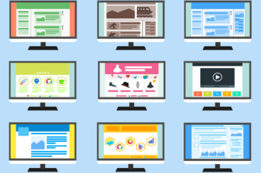
With teams building digital experiences that need to work across countless devices and content types, the old approach of designing full-page templates is starting to show its limits. It creates rigid structures that break too easily when content grows, shifts, or evolves.
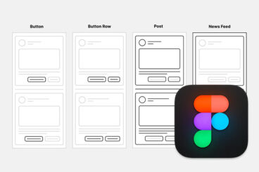
Designers today are thinking in smaller, more adaptable units. Instead of designing full screens or entire pages, they are creating content blocks that can be reused, rearranged, and scaled across different contexts.