Layouts / 15 Dec 2011
Tips and Ideas for Designing With Blurred Images
“The supreme accomplishment is to blur the line between work and play.”
– Arnold Toynbee
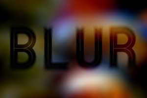
The topic of today’s discussion is blurry photos. No, not the kind that you accidentally take because your kids won’t sit still. The intentional kind, the use of which can serve several practical purposes in design.
We’ll learn all about how to use blur effects to help make text more legible, direct the viewer’s attention, and just make backgrounds more fun. We’ll also take a look at some different types of blurs and how to properly apply selective blurring.