Layouts - Page 8

Advice for crafting layouts and structure that can create a clear, original web design. Break the mould, and build a unique layout!

Designing With Circles: Tips and Advice

Graphics / 3 Oct 2013

Designing With Circles: Tips and Advice

Once shunned by designers, circles seem to be making a comeback. The perfectly round shape – and its oblong counterparts – can be difficult to work with. The shape does not stack as well as the more standard rectangle and creates a much different overall feel.

The circle is a perfect shape, meaning that it is the same no matter how you look at it. It is complete and in harmony with nature – consider how many natural elements are circle-based. So, as a designer, how can you make circles work for you?

How to Use Centered Alignments: Tips and Examples

Layouts / 8 Feb 2013

How to Use Centered Alignments: Tips and Examples

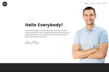
Today we’re going to go back to basics with a “design 101” discussion on alignments. Centered alignments are an easy place to go wrong and if you don’t know how to wield them properly, the result is a very poorly structured page.

Join us as we take a look at why centered alignments tend to be weak, where you should avoid them and how you should be using them.

Think About Images and Text Together

Layouts / 28 May 2012

Think About Images and Text Together

Good design centers on good content. Good content needs good design to survive and stand out among all the other choices out there. The most successful design projects come together because of content-driven design.

It is easy though for designers get stuck in an image or text rut. This frequently happens because people tend think about text and images on their own. What we should be doing is writing copy with images in mind and preparing design projects with the text in mind. Think about how images and text will work together as you plan your next project.

Design to the Power of Three: The Magically Ubiquitous Number

Layouts / 10 May 2012

Design to the Power of Three: The Magically Ubiquitous Number

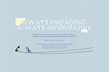
Three is only a number, right? Just one of ten numerals that we use to express value, nothing more. Or is it perhaps a lot more? Is the number three a designer’s best friend? Does it drive art, photography, design, architecture and even the natural order of the universe?

Join us as we take a look at some ways that designers leverage the number three, and more importantly, why you should keep the number three in mind whether you’re designing websites, print ads or even logos.

Above the Scroll: Does It Matter Anymore?

Articles / 4 May 2012

Above the Scroll: Does It Matter Anymore?

There is an ever-growing argument in the design community about whether designing for the scroll on your website is necessary. The arguments for producing stellar design concepts for the first part of the website a viewer will see and those against are wide ranging and are greatly affected by changes in technology.

Where the scroll lands on the screen is even changing with wider monitors and great variances in the size viewers open their web browsers. How can a designer account for all of it?

Big Design in Small Spaces

Articles / 23 Mar 2012

Big Design in Small Spaces

It’s easy to get caught up in the big picture sometimes – what your whole site looks like or the message it conveys. Just as important though, are the small spaces. The look of your banner, sidebars and even the dreaded-in-some-circles above the scroll presentation can bring people into or turn people away from your site.

Effective design in restricted, and even constricted spaces can be the key to adding just the right flair to your site. Simple design tools such as cropping, color, text display and contrast can make all the difference when planning the design for the boxed-in spaces of your next project.

Mastering Multiple Photo Layouts

Layouts / 2 Mar 2012

Mastering Multiple Photo Layouts

Working with multiple photos and images can be a tricky prospect. Done carefully, the use of multiple images can help create an effective and masterful design for both print and web design projects. Some of the best examples of design using multiple photos can be found in the websites of professional photographers.

Consider dominance, number of photos, color, grouping and image quality when working with a variety of photos. Look at details and consider the feel of a project to get the best results when using many images in your project.

Using Pinterest for Design Inspiration

Articles / 23 Feb 2012

Using Pinterest for Design Inspiration

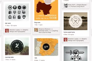
Although Pinterest launched nearly two years ago, it has really hit the mainstream in the last couple months and is cracking top 10 website lists. The site, which allows users to “pin” or save their favorite images and videos on virtual boards by topic, had 40 times the number of visits in December than it did at mid-year, according to Mashable.

The site though can be a great place for designers to organize their thoughts and cobble together bits of inspiration. But you have to have a method to all the pinning so it does not become a time hog.

Practical Tips for Utilizing Columns of Text in Your Layouts

Layouts / 10 Feb 2012

Practical Tips for Utilizing Columns of Text in Your Layouts

Designing around large blocks of type can be tough and more designers are taking the “fewer-is-better” approach when working with columns and large blocks of text. When using a mass of type, such as in a book, text-laden website or print project, much of the emphasis is more on the readability than the actual look of the type.

Typefaces are important but even more important can be the number of columns used in combination with the words. The number of columns you use in a project can vary depending on a number of factors such as typeface and style used, type of project, font size and gutter width and proportion of other elements.

How to Create a Facebook Timeline Cover Photo: Examples and Best Practices

Layouts / 2 Feb 2012

How to Create a Facebook Timeline Cover Photo: Examples and Best Practices

Facebook announced Jan. 24 that it will be moving all users to the timeline format in the next few weeks. Although the change will be mandatory soon, you can make it early as some users have been doing since it was launched in September. Timeline is the new Facebook “wall” and highlights your personal information based on when it happened.

The biggest visual change included in Facebook timeline is creation of a cover photo. When someone lands on your page they not only see a small square profile image but also a large photo that you have selected for the top of your page. The shape can a little intimidating and includes a hole where the profile image rests. But you can crop or create your own timeline cover photo in just a few minutes. Follow along as we take a look at some great examples and advice for creating the perfect cover photo.

Is It Time for Your Business Cards to Go Digital?

Business Card Templates / 10 Jan 2012

Is It Time for Your Business Cards to Go Digital?

Are traditional paper business cards becoming obsolete? Have you considered a digital option? The type of card you use and how it looks can say a lot about you and your work. The style of card – from simple embossed text on a white card to ornate colors and fonts – can be a client’s first impression of your work.

You want to use a card that represents your style and works with the kind of clients you work with. When looking for a business card, consider both digital and paper options and integrate your digital self into paper cards. A business card does more than provide your contact information, it is a gateway to your portfolio as well.

Utilizing Grids in Print Design

Layouts / 27 Dec 2011

Utilizing Grids in Print Design

The basic organization of a design project typically begins with a simple concept – the grid. Whether you decide to work within its constraints or intentionally move away from it, deciding how to use a grid tends to be one of the first steps in the design process.

Print designers have been working on grids since the first newspapers rolled off the presses hundreds of years ago. Most magazines also employ a grid; books are put together using the grid format. The grid can be part of a publication’s identity and helps create a sense of space and organization. Understanding the basics of grid design – from how it originated, to developing your own grid and using it in your workflow processes – will make working within vertical and horizontal constraints a snap.