Typography

Learn how to work with fonts, lay out typography, pair different typefaces, and find collections of inspiring fonts to use in your next project.

Font Pairing Techniques for Digital-First Brands

Font Collections / 17 May 2025

Font Pairing Techniques for Digital-First Brands

For digital-first brands, typography isn’t just a style choice, it’s a core part of how the brand communicates across screens.

The right font pairing can create hierarchy, improve readability, and define the brand’s tone without saying a word.

But with so many fonts to choose from, combining them effectively can be tricky.

Whether you’re building a design system, creating social content, or launching a responsive website, strong font pairing gives your visuals clarity and consistency.

In this guide, we’ll explore practical font pairing techniques to help digital-first brands look sharp, readable, and uniquely original.

How to Identify a Font: Tips, Tools & Techniques

Font Collections / 7 May 2025

How to Identify a Font: Tips, Tools & Techniques

You’ve seen it before—a font on a poster, website, or logo that just looks perfect, and now you can’t stop thinking about it.

But what do you do when you don’t know the name of the font and need to find it for your own project?

Identifying a typeface might feel like searching for a needle in a haystack, but with the right approach (and a few helpful tools), it’s easier than you think.

Whether you’re trying to match a brand’s typography or simply satisfy your own design curiosity, here’s a practical guide to help you identify fonts with confidence.

Kerning vs. Tracking: What’s the Difference?

Typography / 2 May 2025

Kerning vs. Tracking: What’s the Difference?

When it comes to adjusting space between letters, two terms come up frequently: kerning and tracking.

While they might seem similar, they serve distinct purposes in the world of typography. And having a proper understanding of the terms is a must for all types of designers.

In this post, we’ll break down the differences between kerning vs tracking, explain when to use each, and discuss how these adjustments can enhance your designs.

Inclusive Typography: Designing for Dyslexia and Accessibility

Font Collections / 30 Apr 2025

Inclusive Typography: Designing for Dyslexia and Accessibility

For users with dyslexia or visual impairments, thoughtful font choices and layout decisions can make the difference between frustration and clarity.

As more designers and brands embrace inclusive design, it’s important to understand how typography can either support or hinder readability.

Whether you’re building a website, app, eBook, or printed material, accessible typography should be part of your toolkit.

In this guide, we’ll walk through practical tips to create a more inclusive and user-friendly type.

What Are the Different Font Styles? a 101 Intro

Font Collections / 26 Apr 2025

What Are the Different Font Styles? a 101 Intro

Fonts do more than just carry words; they set the tone, express personality, and influence how your message is received.

Whether you’re creating a logo, designing a website, or writing a simple flyer, the font style you choose can make a big impact.

But with so many fonts out there, how do you know which style is which and when to use them?

In this quick 101 intro, we’ll walk through the most common font styles, what makes each one unique, and how they’re typically used in modern design.

Typography in Dark Mode: How to Optimize Fonts for Low-Light UI

Font Collections / 23 Apr 2025

Typography in Dark Mode: How to Optimize Fonts for Low-Light UI

Dark mode has become more than just a trend—it’s a preferred way to browse, work, and interact for millions of users.

From mobile apps and websites to operating systems and dashboards, dark-themed interfaces are now a standard part of digital design.

But while switching the background to black or deep gray might seem simple, designing for readability in these settings requires extra attention, especially when it comes to typography.

Typography in dark mode isn’t just about inverting colors. It involves making thoughtful choices about font weight, spacing, contrast, and even the color of your text.

The goal is to create a comfortable reading experience in low-light environments without causing eye strain or losing clarity.

Here’s how to optimize your fonts for dark mode interfaces.

What Is a Font License? (And Do I Need One?)

Font Collections / 18 Apr 2025

What Is a Font License? (And Do I Need One?)

Almost every design project you encounter will include type of some kind. And it’s very likely that that type will start as a font on a computer, unless you create it yourself. With using specific computer fonts, come some very specific rules regarding their use, which can vary by project.

So what is a font license? Do you need one? And where can you find the tools and resources you need to make sure you are using fonts properly?

Lucky for you, we have a primer. (And the images in this post include fonts that you can license to use in your projects.)

AI-Generated Fonts: Are Machines Designing the Future of Type?

Font Collections / 16 Apr 2025

AI-Generated Fonts: Are Machines Designing the Future of Type?

Typography has always been a deeply human art form. From hand-lettered scripts to digital typefaces crafted with pixel-perfect precision, fonts reflect culture, emotion, and design sensibility.

But now, artificial intelligence is stepping into the world of type design—bringing with it questions, possibilities, and a new way of thinking about how fonts are made.

AI-generated fonts are quickly gaining attention as tools become more advanced and accessible. These tools can generate typefaces from scratch, suggest stylistic variations, and even learn a designer’s preferences over time.

While it’s still early days, it’s worth asking: Are machines truly capable of designing the future of type? And what does that mean for the role of the human designer?

Let’s find some answers.

8 Rules for Creating Effective Typography

Graphics / 11 Apr 2025

8 Rules for Creating Effective Typography

Today we’re going to discuss something that is both a hot trend and timeless art: typography. The basic rules outlined below will help you become more aware of how you structure and use typography in your designs.

Being conscious of these rules can improve nearly everything you create that contains a headline or major typographic element. Let’s get started!

The Psychology of Fonts: How Typography Shapes Brand Perception

Font Collections / 9 Apr 2025

The Psychology of Fonts: How Typography Shapes Brand Perception

Fonts do more than convey words—they tell stories, trigger emotions, and help shape how people perceive a brand.

Whether it’s the confident tone of a bold sans-serif or the refined elegance of a classic serif, typography plays a key role in branding.

It influences how your message is received long before someone reads the fine print.

Understanding font psychology can help you choose typefaces that not only look good but also support your brand’s personality and values.

In this article, we’ll explore how different types of fonts affect perception and how to use them effectively in brand design.

130+ Best Condensed & Narrow Fonts of 2025

Font Collections / 27 Jan 2025

130+ Best Condensed & Narrow Fonts of 2025

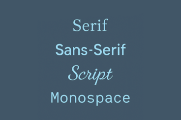
Contrary to popular belief, condensed and narrow fonts don’t make your text cramped or crowded. You just have to know the appropriate time and place to use the font. Condensed fonts are widely used these days for headlines and portraying bold messages, and when deployed in the right place, they can give stunning impact!

It takes a lot of testing and experimenting to find the perfect font for a design, but our tips for choosing and working with condensed and narrow fonts will help get you off to a great start!

Choosing the Best Font for PowerPoint: 10 Tips & Examples

PowerPoint Templates / 30 Dec 2024

Choosing the Best Font for PowerPoint: 10 Tips & Examples

There’s a fine art to creating a great PowerPont presentation that wows. With so many tricks and features in this little bit of software, it’s more likely to see a bad presentation than a good one (and you don’t want to be that person!)

While there are a lot of factors that contribute to the overall design, choosing a suitable font for PowerPoint is near the top of the list. The audience needs to be able to read the words on the screen with ease, to ensure that your presentation is as effective as possible.

So how do you do it? Where do you start when choosing a font for PowerPoint? We have 10 tips for you with a few examples of PowerPoint slides (and templates) that will impress your audience.