Search Results For: images

What Is Storytelling in Design? 10 Tips & Examples

Graphics / 16 Mar 2020

What Is Storytelling in Design? 10 Tips & Examples

Storytelling. It’s one of those buzzwords that is connected to website design and marketing. It seems to be the linchpin that holds these efforts together.

But what does good storytelling in design look like? Why is storytelling such an important element of design projects?

Let’s take a look at some examples of amazing storytelling and how you can apply those concepts to your projects.

Design Trend: Neumorphism

Trends / 11 Mar 2020

Design Trend: Neumorphism

Is the next big thing in website and app design neumorphism? It’s a design trend (named as a mashup of the words new and skeuomorphism) that’s growing in popularity. People seem to either love it or hate it, but it’s interesting enough that Cult of Mac recently pushed an article posing the question: “Is neumorphism the big new look for iOS 14?”

We won’t know the answer for a little while yet, but the trend is gaining traction, particularly on Dribbble, where we see many design trends launch.

Here’s a look a neumorphism to help you get an idea of what it is (and isn’t) so the trend doesn’t pass you by.

Design Trend: Liquid Animation in Web Design

Trends / 4 Mar 2020

Design Trend: Liquid Animation in Web Design

Delightful design accents can be one of those things that creates an unexpected user experience that keeps visitors on your website.

A trending technique that does exactly this is the use of liquid animation in web design. What’s great about his trend is that you can use it in so many different ways to create an interface that works with your content.

Here, we’re going to look at various examples of this trend and how you can make it work for you. (Make sure to click through the examples to get a good feel for how each of these animations works.)

10 Most Impressive Product Label Designs of All Time

Graphics / 28 Feb 2020

10 Most Impressive Product Label Designs of All Time

As the retail industry continues to grow, businesses need to find new ways to make their products stand out. There are countless products that come and go from the shelves. And any design could end up looking stale when everything else looks the same.

How do you earn a place in the consumer’s mind? It’s a combination of diligent market research, professional design, and a strong dose of inspiration. Or simply put, hire a label and sticker printing company to get the job done.

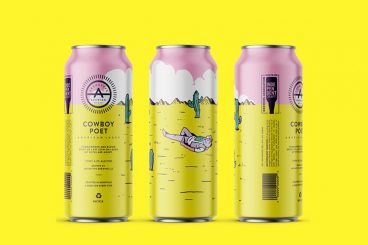
Are these designs the most impressive product labels of all time? It’s really a matter of opinion. But they all stand out in their own way, following many of the best practices in design. They’re all products available on the market today.

Delivering a clear message without writing much is an art. There’s a number of elements that successful stickers have in common to convey a strong message. Elements like bold typeface, simple images rather than complex ones, and novel ideas to trigger memories. The followings are only 10 of those amazing examples.

Design Trend: Mixing Realism and Illustrations

Trends / 19 Feb 2020

Design Trend: Mixing Realism and Illustrations

There’s a trend afoot in website design that mixes real images with illustrations and art elements in interesting ways. And it’s quirky, unique, and beautiful!

It’s a mashup of visual elements that don’t seem like they go together at first, but when done well can create a stunning aesthetic that is highly engaging and delightful.

Here, we’re going to look at examples of this design trend and different ways of mixing realism and illustrations for maximum impact. Some of these sit within fairly corporate designs, and others are completely playful and entertaining. It’s a wide range of applications of a thoroughly unique and interesting trend.

Airline Logos: The 20 Best and Worst Examples

Inspiration / 4 Feb 2020

Airline Logos: The 20 Best and Worst Examples

The best way to learn logo design is to learn from the very best and the worst. In this case study, we explore some of the best airline logos as well as a few terrible logo designs, to help you learn the right way to design a logo and the mistakes to avoid.

Why airline logos? Well, it’s all about branding. Incorporating a brand identity into a logo design is the main part of logo design. It plays a key role in making the logo more appealing to its target audience.

Airlines usually target and serve various audiences. As a result, they are also challenged with designing a logo that appeals to all audiences around the world. This makes airline logos a great source for learning how to properly craft a logo that effectively promotes the brand.

Let’s start by checking out some of the best logos made by airlines.

Lightroom vs Photoshop: Which Is Right for You?

Software / 21 Jan 2020

Lightroom vs Photoshop: Which Is Right for You?

Adobe Photoshop and Lightroom are both amazing apps that designers and photographers can’t live without. However, since both apps have similar qualities, it can be confusing to decide which app is best for your work. We’ll help you make that decision.

Adobe Creative Cloud offers a special “Photography” plan that gives you access to both Photoshop and Lightroom apps for a single price. But it only comes with 20GB of cloud storage.

These two apps have very different functionalities when it comes to editing and composing photos and graphics. It’s important that you choose the right app depending on the type of work you do to make the most of the software. Plus, if you choose to buy a single app, you get 1TB of cloud storage and more great features as well.

Needless to say, there are many benefits to finding the right tool for your work. In this guide, we look at some of the key features of both Photoshop and Lightroom. And find out which app is right for you.

Vintage Graphic Design: Inspiration, Ideas + Modern Takes

Trends / 27 Nov 2019

Vintage Graphic Design: Inspiration, Ideas + Modern Takes

Vintage graphic design is a nifty way to create an old-school feel for projects. Today we’re exploring the vintage graphic design trend, and how to use it in your design projects.

Vintage elements can include typography, illustrations, photo styles, and even entire aesthetic palettes. Further, there are different eras to choose from when you want to go for a vintage feel.

Vintage themes from different time periods can provide completely different visual properties and techniques to play with.

Let’s explore some of them!

What Is an Icon Font? (And How to Use One)

Font Collections / 18 Nov 2019

What Is an Icon Font? (And How to Use One)

Icon fonts are a popular solution to a common CSS problem; how to incorporate web icons into your website design in an efficient, fast-loading way.

With plenty of services available to make choosing and using an icon font easy, you don’t have to create your own from scratch. Icon fonts are all over the internet.

But what exactly is an icon font? And how do you use them? Here’s a guide to everything you need to know about icon fonts.

How to Make a Brochure on Microsoft Word (Using a Template)

Brochure Templates / 13 Nov 2019

How to Make a Brochure on Microsoft Word (Using a Template)

Did you know you can make a brochure using a common tool such as Microsoft Word? It’s actually a really capable tool for brochure design, for creating a high-quality, professional outcome.

With a good template, you can turn a simple Word document into a carefully designed brochure that you can get printed or push as a PDF online.

Here, we’ll walk through the steps using a template that you can download from Envato Elements.

You can use what you learn for any type of brochure, using Microsoft Word – a tool you’re already familiar with! Whether you’re looking for a tri-fold, A5, or larger brochure, these steps will work for any type of design.

What Is Adobe XD? a 101 Intro

Adobe XD Templates / 13 Nov 2019

What Is Adobe XD? a 101 Intro

Adobe’s UX design tool seems to be picking up speed. Have you tried Adobe XD yet? The tool is part of the design giant’s suite of software. It meets a need that was being filled by other tools such as Sketch and Figma. But thanks to Adobe’s large customer base, XD is proving itself a viable option.

Here, we’ll look at what Adobe XD is – and isn’t – to help you figure out if this tool might be worth exploring.

Whether you’re already sold on Adobe XD and want to learn more, or you’re weighing it up against the pros and cons of other tools, we’ll give you a helpful introduction to make the decision easy.

Favicon Examples, Best Practices and Techniques

Graphics / 11 Nov 2019

Favicon Examples, Best Practices and Techniques

Do you ever pay attention to those tiny icons at the tops of browser tabs? How about when you save a shortcut to a website or page online? Those tiny images, or favicons, are designed especially for that purpose.

There’s a pretty distinct difference between what makes for a good or bad tiny icon. You’d be forgiven for thinking that design decisions at the tiny scale matter less. But a poorly designed favicon can reflect badly on your brand.

Today we’re looking at what these icons are, basic design techniques for them, and the specs you’ll need to follow.