1. Authors
  2. Carrie Cousins

Carrie Cousins

Carrie Cousins

Carrie is a freelance writer with years of experience in web and graphic design. Sports fanatic. Information junkie. Designer. True-believer in karma.

E-Commerce Website Design: 10 Interesting Examples

Inspiration / 8 Oct 2013

E-Commerce Website Design: 10 Interesting Examples

E-commerce design is one of the most common – and sometimes most overlooked – types of design project. Just think of how often you click “buy now” on a website.

But what makes it work? Of utmost importance in e-commerce design is user experience and the purchase flow, but more and more sites are also beginning to develop awesome design schemes as well. Here, we’ll look at ten e-commerce sites that function well, and also look fantastic.
Designing With Circles: Tips and Advice

Graphics / 3 Oct 2013

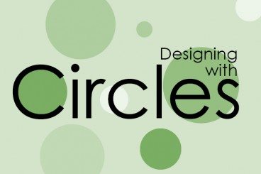
Designing With Circles: Tips and Advice

Once shunned by designers, circles seem to be making a comeback. The perfectly round shape – and its oblong counterparts – can be difficult to work with. The shape does not stack as well as the more standard rectangle and creates a much different overall feel.

The circle is a perfect shape, meaning that it is the same no matter how you look at it. It is complete and in harmony with nature – consider how many natural elements are circle-based. So, as a designer, how can you make circles work for you?

Pros and Cons of Working With Design Kits

Graphics / 23 Sep 2013

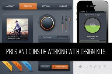
Pros and Cons of Working With Design Kits

Design kits seem to be everywhere these days. From UI kits, to templates and grids, to complete design kits, what makes these tools so popular (and what are the disadvantages)?

Today we’re going to take a look at the pros and cons of using different types of design kits, and even show you a few kits in the examples that might be worth trying out for various purposes.

10 Popular Trends in Modern Web Design Elements

Inspiration / 9 Sep 2013

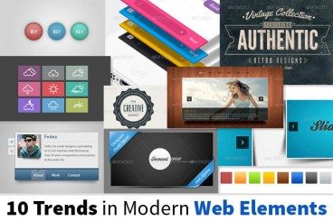
10 Popular Trends in Modern Web Design Elements

Trends in web design can change and fade almost as quickly as they become fashionable. But so far in 2013, a handful of trends have really seemed to take web design by storm, and seem to be sticking.

Today, we’re going to examine ten trends in modern web elements and showcase some great examples of each — everything from vintage typography and circles, to vibrant colours and handy vCards. Even better for you is that all of the examples below are available for download (some free, some paid).

Do You Need a Style Guide?

Business / 2 Sep 2013

Do You Need a Style Guide?

It’s a simple question: Do you need a style guide? And it has a simple answer: Yes. Any brand, company, blog or webpage that wants to create and maintain consistency and a professional feel should have a style guide.

Style guides are a must for any publisher with multiple employees. This is especially important if more than one person will work on any brand elements (from the website to printed materials), and to ensure that transitions between employees are seamless in the eyes of users. Today, we take a look at well-documented style guide from MailChimp, and highlight things you can take away in creating your own document for the first time.

10 Digital Design Terms You Need to Know

Business / 27 Aug 2013

10 Digital Design Terms You Need to Know

Design jargon is everywhere. And you need to be able to speak the language. Working on digital projects has its own set of terminology. From dither to color values to fluid or fixed layouts, there are a few terms every designer needs to have a grasp of.

So we’ve made it easy for you, and put together a list of digital design terms you need to know. This list started as a top 10, but we added some bonus jargon for comparative purposes. How many of these terms are you already familiar with?

Graphics / 12 Aug 2013

8 Tips for Print Designers Switching to Web & Digital Design

More designers are working across platforms these days, switching back and forth between print and digital projects. Although much of the theory is the same, in practice there are a lot of technical differences when it comes to working on something that will be printed versus a website. It takes a specific set of knowledge and skills to work effectively and efficiently in both environments.

But it is possible. Here we share eight tips for print designers making the switch to digital projects. (And I can vouch for every single tip as a designer who has made the switch.)

10 Printing Terms You Need to Know

Business / 7 Aug 2013

10 Printing Terms You Need to Know

More and more designers these days are working in a variety of mediums — both digital and print. But it can take a different set of specifications to put together a successful project for each. Print design has its own jargon.

Understanding how printing works (and how to speak the language of printers) is important for any designer. Don’t think this applies to you because most of your business is web-based? Consider this: At some point a client will ask for print components to go with the website, whether they are business cards or posters or just a great handout for presentations. Knowing the printing basics and terminology will help you bridge the gap. Here are ten key terms you need to know.

The Importance of Designing for Readability

Mobile / 22 Jul 2013

The Importance of Designing for Readability

Text is not an afterthought in the design process. It should be your first consideration.

Readability should be one of the top concerns when it comes to any design project. If text can’t be read, then why are you designing in the first place? Good design delivers content in a way that is understandable; readability is a big part of comprehension. Today we’ll be discussing how you can plan a design around the words, so that your projects are easy to read.

Understanding Color: Dominant vs. Recessive Colors

Graphics / 11 Jul 2013

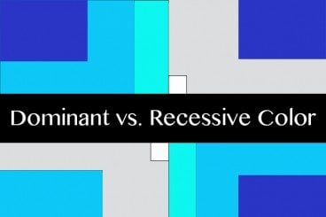
Understanding Color: Dominant vs. Recessive Colors

Ever wonder why your colors don’t look quite right in some situations? It could be a simple as the color choice. Certain colors tend to take on the characteristics of other hues, while others always look pure. In addition, the human eye perceives color in different ways based on whether it is in the foreground or background.

This phenomenon can be explained through dominant and recessive colors. Join us as we take a closer look at these two terms today, and delve into deeper understanding of how they can guide your design choices and decisions.

10 Key Features of Popular WordPress Themes

Inspiration / 1 Jul 2013

10 Key Features of Popular WordPress Themes

WordPress is the framework behind many of the websites and blogs you visit every day, including this one. Latest numbers from WordPress attribute the framework as the backbone of 17 percent of the web.

The platform is simple to use, and thanks to plenty of theme builders it can be customized in a variety of ways for everything from blogs, to portfolio sites, to e-commerce. Themes are the element that take WordPress to the next level, giving almost anyone of any skill level the ability to create a site that doesn’t look like a basic template. There are a few key components that set the best themes aside from the rest. The most popular WordPress themes – both paid and free – tend to have 10 key features in common. Let’s take a look at them.

How to Design a Resume That Stands Out

CV & Resume Templates / 24 Jun 2013

How to Design a Resume That Stands Out

Resumes are everywhere. They can be good, bad or downright embarrassing. But one thing is certain — if you want a job, yours must stand out in a good way. The design needs to reflect your personality, and the information needs to be organized, relevant and spot-on.

More often than not in today’s job market, you may even have several versions of your resume; one tailored toward different types of companies, one for potential clients or another as a showcase piece in your portfolio.