1. Authors
  2. Carrie Cousins

Carrie Cousins

Carrie Cousins

Carrie is a freelance writer with years of experience in web and graphic design. Sports fanatic. Information junkie. Designer. True-believer in karma.

How to Create a Facebook Timeline Cover Photo: Examples and Best Practices

Layouts / 2 Feb 2012

How to Create a Facebook Timeline Cover Photo: Examples and Best Practices

Facebook announced Jan. 24 that it will be moving all users to the timeline format in the next few weeks. Although the change will be mandatory soon, you can make it early as some users have been doing since it was launched in September. Timeline is the new Facebook “wall” and highlights your personal information based on when it happened.

The biggest visual change included in Facebook timeline is creation of a cover photo. When someone lands on your page they not only see a small square profile image but also a large photo that you have selected for the top of your page. The shape can a little intimidating and includes a hole where the profile image rests. But you can crop or create your own timeline cover photo in just a few minutes. Follow along as we take a look at some great examples and advice for creating the perfect cover photo.

Pick the Right Typefaces for Your Project

Typography / 26 Jan 2012

Pick the Right Typefaces for Your Project

Sometimes the most daunting part of a new project can be the brainstorming phase. Thinking of color schemes and font selections can be inspiring in your head, but really tough when you start mixing and matching elements on paper or for your website.

Understanding some of the history of fonts and typography can help make any project a little easier. Learn how to pair different typefaces to get desired effect every time and learn what things to avoid. Sharp typography and font selections can really make or break just about any project.

Keep That New Year’s Resolution and Make the Leap From Print to Web Design

HTML / 16 Jan 2012

Keep That New Year’s Resolution and Make the Leap From Print to Web Design

You’ve been designing for print since college and have an eye for what makes visuals work. But the landscape has changed (and for some, might even look a little scary). So when the ball dropped at the start of 2012, your resolution was to learn a little more about the digital side of it all and make yourself that much more marketable.

Now is the time to get started. There are tons of resources out there to help print designers get their feet wet in coding, HTML and digital design. Because of the skills you already possess as a print designer, the transition might even be easier than you think. You already know how to use text, color and images, but need the skills to make it happen in the online format. With a little time and dedication, almost anyone can learn the basics with a few great (and free) tutorials right at your computer.

Is It Time for Your Business Cards to Go Digital?

Business Card Templates / 10 Jan 2012

Is It Time for Your Business Cards to Go Digital?

Are traditional paper business cards becoming obsolete? Have you considered a digital option? The type of card you use and how it looks can say a lot about you and your work. The style of card – from simple embossed text on a white card to ornate colors and fonts – can be a client’s first impression of your work.

You want to use a card that represents your style and works with the kind of clients you work with. When looking for a business card, consider both digital and paper options and integrate your digital self into paper cards. A business card does more than provide your contact information, it is a gateway to your portfolio as well.

Utilizing Grids in Print Design

Layouts / 27 Dec 2011

Utilizing Grids in Print Design

The basic organization of a design project typically begins with a simple concept – the grid. Whether you decide to work within its constraints or intentionally move away from it, deciding how to use a grid tends to be one of the first steps in the design process.

Print designers have been working on grids since the first newspapers rolled off the presses hundreds of years ago. Most magazines also employ a grid; books are put together using the grid format. The grid can be part of a publication’s identity and helps create a sense of space and organization. Understanding the basics of grid design – from how it originated, to developing your own grid and using it in your workflow processes – will make working within vertical and horizontal constraints a snap.

10 Tips for Managing Creative People

Business / 16 Dec 2011

10 Tips for Managing Creative People

Today’s workplace is filled with different personality styles. Understanding those differences and how they affect your workforce can make you a more effective manager.

Working with “left-brained” (more analytical) versus “right-brained” (more creative) employees has its own set of rules. Most creative workers use the right-brain style of learning and working, which is a visual, random, emotional and somewhat impulsive style of learning, according to data compiled at Western Michigan University. Right brain people like to work with sound in the background (note all those ear buds around the office), like to move about while thinking about concepts and generally start with a big idea and narrow it to the details. Left-brained workers and more verbal and logical, like things in order and prefer a formal workplace.

Take a look at your staff. How many right-brain workers are in the room? My guess it the number is pretty high among designers. Here are a few tips for managing your creative people in a way they can relate to.

Hands on With the New Twitter Design

Reviews / 9 Dec 2011

Hands on With the New Twitter Design

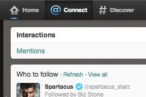
Twitter launched a radically new layout to users Thursday. The first to see the new look were mobile users through the Twitter iPhone and Android apps. After updating those apps, the new look of Twitter became active on those users’ computers as well. All other users will begin to see the updated Twitter look over the course of several months.

The results are mixed. The new look and interface is great for mobile users and the sleek interface is cool. Features on the computer version mix the super-sleek interface with a few bonuses but also a few misses. Pages have more pop but still have the look and feel you would associate with Twitter. The site also rolled out branding pages for companies that have a nice look but could change the organic feel that has brought people to Twitter.

Visually, Twitter has reinvented itself consistently across various platforms. Aside from slight, device-specific tweaks the interface looks the same on the website, on a tablet and on a smartphone (no update for the Mac app as of yet). The biggest plus for designers and other visual professionals is an enhanced use of images to push you toward content. Twitter is starting to define itself as more than just a 140-character platform.

Typography 101: Understanding the Anatomy of a Letter

Typography / 7 Dec 2011

Typography 101: Understanding the Anatomy of a Letter

Every designer, whether you’re in print or web, should possess a basic understanding of fonts and type. Using the right typeface and understanding how a font will impact your design can add that extra pop to print and digital projects and will set them apart from all others.

One important area to understand is the anatomy of type. Ascenders, descenders and serifs may sound like words from another language but are the basis for understanding the style of a typeface and how if relates to your project. Today we’ll take a brief run through of some terminology that you should know.