Font Collections / 26 Apr 2025
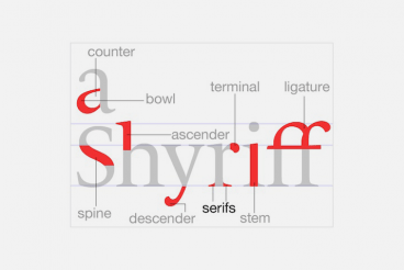
What Are the Different Font Styles? a 101 Intro
Fonts do more than just carry words; they set the tone, express personality, and influence how your message is received.
Whether you’re creating a logo, designing a website, or writing a simple flyer, the font style you choose can make a big impact.
But with so many fonts out there, how do you know which style is which and when to use them?
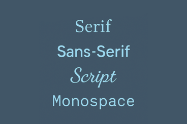
In this quick 101 intro, we’ll walk through the most common font styles, what makes each one unique, and how they’re typically used in modern design.