Search Results For: break

Google Material Design: Everything You Need to Know

UX Design / 24 Feb 2015

Google Material Design: Everything You Need to Know

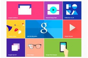
You probably keep hearing the phrase “material design” popping up in conversations. The concept is pretty new; it was introduced in the summer and references a new design language from the folks at Google.

But material design is more than just an idea; it is likely to cause designers to completely rethink web and app design processes. Sites are already beginning to role out design schemes using Google’s material design documentation. So now is the time to learn what it’s all about and if a material design framework is in your future.

Minimal Design: How to Design More With Less

Minimalist Graphic Design / 23 Feb 2015

Minimal Design: How to Design More With Less

Minimalism and the use of whitespace are big design trends right now. Mastery of these techniques might look easy at first glance, but it is actually quite difficult to design with so much open space and so few objects. It can be hard for clients to come to terms with because they often want as much information as possible on a canvas.

But many designers like the look of minimal styles and maximizing whitespace can be a fun challenge. It’s a technique that translates well across mediums and can be used in print, web design and on packaging. Here, we’ll look at the trend and how to design more with less.

6 Tips for Designing Signs and Billboards

Graphics / 16 Feb 2015

6 Tips for Designing Signs and Billboards

Your next project assignment: designing a sign for an upcoming event. It will be displayed on billboards around town and printed on smaller yard signs as well. If you are already panicking at the idea, don’t worry — designing a sign is not much different than any other project.

The big difference is scale. It’s going to be a lot larger in size than what you might be used to. Other things to think about when designing signage are location, color, typography, contrast and material the sign will be printed on. Thinking about each of these factors in advance can make for a better sign design experience.

How Color, Type and Space Can Impact Mood

Graphics / 12 Feb 2015

How Color, Type and Space Can Impact Mood

Do you ever think about mood when you are designing? Mood has impact in two ways – the mood of the project itself and the mood of users. Together they create an experience that connects each user to the project.

While you can’t always account for the mood of users, or their good and bad days, you can create an aesthetic that emphasizes the right mood for your project. Three basic design techniques – color, typography and space – are key components for establishing the mood of a project.

10 Tips for Designing Static Ads

Graphics / 21 Jan 2015

10 Tips for Designing Static Ads

Designing the perfect static ad is no easy feat. It might even be impossible. Designing ads can go against many of the things you think as a designer. Many companies want to cram as much information into a space as possible and many users put up roadblocks when it comes to viewing ads.

The catch is creating something that people want to interact with, despite the fact that it’s an ad. The advantage of a static ad is that is seems less obtrusive than some animated, audio or video options. They also have a classic style about them that makes designing fun. Here are 10 tips for creating an ad that people will look at, with some ads as they actually appear on popular websites.

Website Design for Kids: Tips and Advice

Graphics / 24 Nov 2014

Website Design for Kids: Tips and Advice

Designing a project for children is a rather common assignment. From websites to packaging to other images, creating something that is kid-friendly will likely be asked of most designers at some point. But how can you make something kids and adults will appreciate?

That’s the real trick. Kids and adults have to feel engaged by what they are seeing. There are some things that you can do in the design process. Consider elements such as color, typography, gamification, language, animation, storyline and age group for the best success. Today we’re offering some advice and insight into this very topic!

Using Lines and Curves in Design Projects

Graphics / 7 Jul 2014

Using Lines and Curves in Design Projects

Some of the most subtle parts of a design can be the most important. Think about some of the details in design projects such as lines and curves. These simple shapes can be used in the foreground, background lettering or as a dominant art element.

Not every line is created the same. From thickness to orientation to amount of curvature, these simple shapes can have quite a bit of meaning. So before you draw that first line, here’s a primer and tips for using lines and curves in design projects.

Design Science: What Is Gestalt Theory?

Inspiration / 18 Jun 2014

Design Science: What Is Gestalt Theory?

If you are like me, it’s been a while since you finished you last formal design class. (And some of us never had any formal design classes.) So a refresher in some of the science behind design seems important. What is gestalt theory and do I really need to understand it?

Today, we’ll focus on one of the guiding principles of design. Gestalt theory is something you likely encounter and use almost every day. But do you understand the theory behind your actions? And how can you make even better use of this concept in your design work?

How to Use Cool Color in Design Projects

Inspiration / 10 Jun 2014

How to Use Cool Color in Design Projects

Cool and warm colors. These descriptions are commonly used to describe hue choices in a variety of conversations – fashion, beauty, decorating and design. But while we commonly talk about warm and cool, do you really know what these terms mean and how to use the colors?

Today, we will look at using cool color in design projects and create a few color palettes with cool hues. (Also make sure to check out the recent Design Shack article featuring warm colors.)

How to Use Warm Color in Design Projects

Inspiration / 2 Jun 2014

How to Use Warm Color in Design Projects

Warm and cool colors. These descriptions are commonly used to describe hue choices in a variety of conversations – fashion, beauty, decorating and design. But while we commonly talk about warm and cool, do you really know what these terms mean and how to use the colors?

Today, we will look at using warm color in design projects and create a few color palettes with warm hues. We’ll also investigate the theory and meaning behind different choices.

The Complete Guide to Special Characters

Typography / 21 Apr 2014

The Complete Guide to Special Characters

Not everything is as easy as ABC or 123. Sometimes your copy might require a character outside of the basic alphabet. That’s where special characters and glyphs come in. (Look around, they are more common than you might think at first.)

Depending on your workflow, inserting a glyph can be as simple as a keystroke or a multi-step process. Much of it depends on the software you are using, typography palette and how the final product will be published. Here, we are going to take a look at special characters, examples of use and tips for success.

Todoist: A Simple and Powerful Tool for Designers

Software / 31 Mar 2014

Todoist: A Simple and Powerful Tool for Designers

There are so many apps and productivity tools out there, making it hard to find things that fit your needs the best. Some tools are packed with too many gimmicks, which can make it hard to be productive. Others are difficult to use or understand.

Enter Todoist. This tool is simple and powerful. After only five minutes, I was beginning to feel like a super-user. And what’s even better is that it is designed well. Not only does this tool work beautifully, it looks great at the same time. Here’s a look at Todoist, how it works and how you can use it in your workflow.