Inspiration / 17 Nov 2014
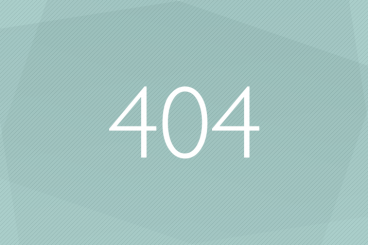
What Makes a Great 404 Error Page?
No one wants to think website visitors are spending time on error pages, but it happens. The 404 error page is one place that these interactions happen rather frequently. Design it in a way that speaks to users rather than encouraging them to leave your site.
More memorable and less frustrating 404 error pages are the most successful. They can also be the most fun to design. So what can you do to create the best 404 page for your site? Here are a few tips, tricks and gallery of great examples.