Graphics - Page 14

Inspiring advice, tips, and suggestions for improving your graphic design skills, logo design, working with templates, and more.

How to Build a Brand Bible & Visual Style Guide

Graphics / 13 May 2013

How to Build a Brand Bible & Visual Style Guide

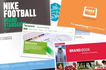
Every brand, from the smallest website or startup, to corporate giants such as Nike or McDonald’s, need a set of branding guidelines and rules to maintain their identity. This document, which can range from a couple of pages, to several hundred, is the thread that holds together what the public sees from a company.

A brand bible establishes the voice and personality of a company, as well as who the public will see, and it governs every aspect of communication from the company. The brand bible is the basis for all interactions on behalf of a company – personal communications, social media, advertising and design. While a brand bible focuses on many things, we are really going to look at how it affects design.


Check Out the New American Airlines Logo

Graphics / 23 Jan 2013

Check Out the New American Airlines Logo

American Airlines has had the same logo for forty-five years. That’s definitely a pretty impressive stretch! They’ve decided to hang up their Helvetica though and look to not only a new typeface, but a new eagle and even a new livery design.

Read on to see the logic behind the new design and whether or not I think it’s another chapter in a long line of recent brand redesigns gone bad.

Twitter’s New Logo: The Geometry and Evolution of Our Favorite Bird

Graphics / 11 Jun 2012

Twitter’s New Logo: The Geometry and Evolution of Our Favorite Bird

Recently, Twitter unveiled its brand new logo. It’s certainly not the first time this has happened, but the company seems insistent that this is going to be the last change we see for a while.

Join us as we take a look at the new logo, discuss why it’s better or worse and analyze the interesting geometry that was used to create the icon. Is there some hidden magic in using circles to create your logo? Read on to find out.

Style Tiles: The Flip Side of Wireframes

Graphics / 29 Mar 2012

Style Tiles: The Flip Side of Wireframes

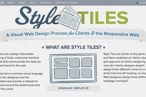
Style Tiles provide a fresh and productive way to approach the design process. They allow you to specifically hone in and focus on a project’s personality and mood without worrying about specific layout decisions.

Today we’re going to show you exactly what Style Tiles are, why you should use them and how to incorporate them into your design process. Follow along and you just might change the way you design forever.

5 Gorgeous Note & Point Presentations You Have to See

Graphics / 16 Mar 2012

5 Gorgeous Note & Point Presentations You Have to See

One of my favorite sites for design inspiration is Note & Point, which is a fantastic curator of great looking presentation decks (Keynote + PowerPoint = Note & Point). Not only is this site chock full of awesome design examples, most of their presentations are actually design and development related so you learn some great stuff along the way!

Today we’re going to look at five of my favorite Note & Point decks, which will teach us a ton of great stuff about presentation design.

New Logos for the Marlins, Orioles and Jays: Did They Get Better or Worse?

Graphics / 17 Jan 2012

New Logos for the Marlins, Orioles and Jays: Did They Get Better or Worse?

With a new year always comes new branding attempts. Organizations want a fresh face to signal progress and ongoing evolution and branding is the vehicle that designers use to achieve this goal.

As we all know quite well, this is a risky venture with large entities. If it goes well, your customers (or fans in this case) love you for it. If it doesn’t, you’re setting yourself up for plenty of public ridicule. Today we’re going to venture into the world of sports and check out three new Major League Baseball team logo designs. Which teams are updating their look for the new year? Were they successful or is the result a surefire embarrassment? Read on to find out!

When the Photo Doesn’t Fit the Space: Tips and Tricks for Making It Work

Graphics / 12 Jan 2012

When the Photo Doesn’t Fit the Space: Tips and Tricks for Making It Work

You’ve been there a thousand times, staring at a big empty canvas that simply doesn’t seem to work with the photo that the client has provided. Perhaps you have a vertical space and a horizontal photo (or vice versa), or maybe the image is simply too small to resize without unacceptable quality loss. What now?

Today we’ll go over some tricks of the trade and teach you how to cope with images that don’t fit where you need them to. The next time you run into a problem, you’ll be ready!

How to Use Synergy to Take Your Designs to the Next Level

Graphics / 26 Dec 2011

How to Use Synergy to Take Your Designs to the Next Level

“Synergy” – In business this is a term that has been so often abused that it has become a meaningless buzzword. Some of you may cringe just at the sound of it.

However, in design synergy is a powerful weapon that, when wielded properly, can make your designs much more interesting and creative. What is synergy? Where can we find some solid examples of synergy in design? How can you use synergy in your work? Read on to find out.

Five Fascinating Things You Didn’t Know About Famous Car Logos

Graphics / 5 Oct 2011

Five Fascinating Things You Didn’t Know About Famous Car Logos

Automobile logos represent some of my favorite emblems. I recently became curious as to the origins of several of these popular icons and came across some incredibly interesting facts!

Join us as we look back at some of the most well known logos around and uncover some of their unbelievable secrets!

Graphics / 20 Sep 2011

10 Tips for Designing Better Infographics

Infographics have been around for ages but in recent years they’ve really come into the spotlight as an almost irresistible way to communicate complex scenarios and information. We can’t help it, when we see a link for an infographic, we almost have to check it out!

If you’re at all interested in infographic design, read along as we take a look at some of our favorite examples and discuss some important do’s and don’ts for creating compelling and effective graphics.

Graphics / 15 Sep 2011

Then and Now: The Evolution of Cereal Mascots

Today we’re going to have some good old nostalgic fun and take a walk through cereal box history to look at some beloved characters that have been with most of us since we could chew.

Keep reading to see what your favorite cereal box mascot looked like years ago versus today!

Graphics / 9 Aug 2011

Tips for Designing With Multiple Photos

Photography is one of your most powerful resources as a designer. Here we’ll take a look at some clever and unique ways to create photo-centric designs using multiple images.