Graphics / 30 Jun 2014
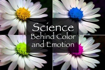
The Science Behind Color and Emotion
Color resonates with people in different ways. We all have a favorite color or color that we use more during specific periods of life. But the color you use in a design project can say a lot about the work itself. That’s a scientific fact.
The science behind our emotional connections to color is a complicated one. But it is becoming more clear through anecdotal knowledge and scientific experimentation. Here are five hypotheses and a fifth-grade level experiment you can try to help us better design with color and understand its emotional impact.