Graphics - Page 13

Inspiring advice, tips, and suggestions for improving your graphic design skills, logo design, working with templates, and more.

7 Tips for Designing a Better Checkout Page

Graphics / 26 Nov 2014

7 Tips for Designing a Better Checkout Page

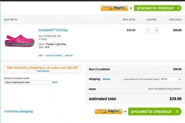
With the holiday season right around the corner, many of us will be doing some shopping online. (OK… maybe a lot of shopping!) The checkout page of a website can make that experience one to remember, or one you wish you could forget.

If you are designing a checkout page, there are so many considerations – functionality, usability, security and design. The last element is something every designer can have impact on. A checkout page should not be designed as an afterthought; it is arguably the most important page in the online shopping experience.
Website Design for Kids: Tips and Advice

Graphics / 24 Nov 2014

Website Design for Kids: Tips and Advice

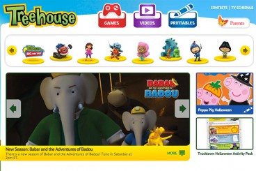
Designing a project for children is a rather common assignment. From websites to packaging to other images, creating something that is kid-friendly will likely be asked of most designers at some point. But how can you make something kids and adults will appreciate?

That’s the real trick. Kids and adults have to feel engaged by what they are seeing. There are some things that you can do in the design process. Consider elements such as color, typography, gamification, language, animation, storyline and age group for the best success. Today we’re offering some advice and insight into this very topic!

The Designer’s Guide to Visual Punctuation

Graphics / 3 Nov 2014

The Designer’s Guide to Visual Punctuation

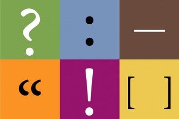
Punctuation is more than just periods and exclamation points. In terms of design, punctuation can be anything that causes a reader or user to stop or pause. It can happen while reading text or as the eye moves from one element to another. These bits of visual punctuation are everywhere and are vital parts of any design concept.

The key elements of visual punctuation include common readable punctuation marks as well as space, lines, rules, icons and color.

How to Create an Emotional Connection With Design

Graphics / 9 Jul 2014

How to Create an Emotional Connection With Design

Every project you complete connects with users in some way. The design communicates a message and a tone. The emotional tone is what we are going to take a deeper look at and try to better understand.

Emotional connections fall into four basic category pairs – joy and sadness, trust and disgust, fear and anger, and surprise and anticipation. Understanding this range of emotion and how it relates to a visual message is important so that your design projects are received as they are intended. As you read through this post, take a look at the featured websites and think about how each one makes you feel and what parts of the visual aesthetic contributes to that emotion.

Using Lines and Curves in Design Projects

Graphics / 7 Jul 2014

Using Lines and Curves in Design Projects

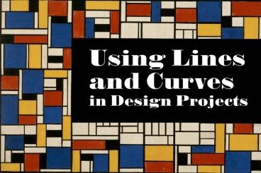
Some of the most subtle parts of a design can be the most important. Think about some of the details in design projects such as lines and curves. These simple shapes can be used in the foreground, background lettering or as a dominant art element.

Not every line is created the same. From thickness to orientation to amount of curvature, these simple shapes can have quite a bit of meaning. So before you draw that first line, here’s a primer and tips for using lines and curves in design projects.

The Science Behind Color and Emotion

Graphics / 30 Jun 2014

The Science Behind Color and Emotion

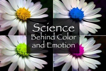
Color resonates with people in different ways. We all have a favorite color or color that we use more during specific periods of life. But the color you use in a design project can say a lot about the work itself. That’s a scientific fact.

The science behind our emotional connections to color is a complicated one. But it is becoming more clear through anecdotal knowledge and scientific experimentation. Here are five hypotheses and a fifth-grade level experiment you can try to help us better design with color and understand its emotional impact.

6 Famous Logos That Leverage Inconsistent Design

Graphics / 29 Dec 2013

6 Famous Logos That Leverage Inconsistent Design

One of the most powerful tools that you can use to improve any design is repetition. Repeating colors, shapes and other visual elements throughout a design increases consistency and familiarity so that the design feels more attractive.

But what about the flip side of this idea? Is it possible to wield inconsistency in such a way that it improves the quality of a design? It turns out that lots of well known logos use this very tactic. Read on to see what they are.

Designing With Circles: Tips and Advice

Graphics / 3 Oct 2013

Designing With Circles: Tips and Advice

Once shunned by designers, circles seem to be making a comeback. The perfectly round shape – and its oblong counterparts – can be difficult to work with. The shape does not stack as well as the more standard rectangle and creates a much different overall feel.

The circle is a perfect shape, meaning that it is the same no matter how you look at it. It is complete and in harmony with nature – consider how many natural elements are circle-based. So, as a designer, how can you make circles work for you?

5 Traits of Successful Minimalism

Minimalist Graphic Design / 2 Oct 2013

5 Traits of Successful Minimalism

At first glance, minimalist websites might look like they’ve just been slapped together as quickly as possible. After all, they’re plain and simple, and most people tend to associate lots of detail with good craftsmanship. But the same rules just don’t apply to the online world.

It only takes a small amount of user interaction to quickly reveal the quality of a minimalist site. This is because the original idea that fueled the rise of minimalism was that functionality is inherently beautiful. A design that clarifies and reveals the structure of a website can be just as appealing as one that obscures its purposes behind fancy decorative additions. Furthermore, it often yields a much better user experience, because those unnecessary distractions are eliminated.

Pros and Cons of Working With Design Kits

Graphics / 23 Sep 2013

Pros and Cons of Working With Design Kits

Design kits seem to be everywhere these days. From UI kits, to templates and grids, to complete design kits, what makes these tools so popular (and what are the disadvantages)?

Today we’re going to take a look at the pros and cons of using different types of design kits, and even show you a few kits in the examples that might be worth trying out for various purposes.

Current Color Trends: Muted Pastels

Graphics / 30 Jul 2013

Current Color Trends: Muted Pastels

Of late, you may have noticed a crop of new site designs have a softer and lighter look. After all the rainbow brights and even neon or fluorescent hues that have been so popular of late, it seems that some designers are taking a more subtle approach by using lighter or muted colors.

Although the same basic treatments are still being utilized — like colorized photography or color blocking — the new hues are making for a more refined and understated variation on these themes. Today we’re going to delve into this trend a little more, and explore various design examples and approaches.

Understanding Color: Dominant vs. Recessive Colors

Graphics / 11 Jul 2013

Understanding Color: Dominant vs. Recessive Colors

Ever wonder why your colors don’t look quite right in some situations? It could be a simple as the color choice. Certain colors tend to take on the characteristics of other hues, while others always look pure. In addition, the human eye perceives color in different ways based on whether it is in the foreground or background.

This phenomenon can be explained through dominant and recessive colors. Join us as we take a closer look at these two terms today, and delve into deeper understanding of how they can guide your design choices and decisions.