Google Slides Themes / 16 Jul 2026
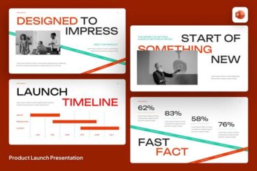
20+ Trustworthy Pitch Deck Templates for Google Slides
Creating a strong pitch deck starts with choosing the right design foundation.
Pitch deck templates for Google Slides are built to help you structure your presentation in a clear and engaging way.
Instead of worrying about layout and formatting, you can focus on refining your message.
These templates include professionally designed slides with balanced compositions, clean typography, and visual elements that make your content easier to understand.
Whether you’re pitching a startup, presenting a product, or sharing a business strategy, you can tailor the design to reflect your unique style and goals.