Business / 15 Jul 2015
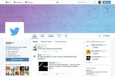
How to Create a Twitter Header Photo: Examples and Best Practices
With more than 302 million monthly users and 500 million tweets per day, chances are you are using Twitter to promote yourself, brand or business. (And if you aren’t using the 140-character platform, what are you waiting for?)
Twitter customization is a big part of your social media strategy. As a designer, creating a great header photo is an important part of the puzzle. Here we’ll take a look at ways to create a header photo and overall profile that stand out among the millions of other Twitter personalities out there and showcase a few pages for design inspiration.