Trends / 28 Oct 2019
The Art of Website UI Button Design: 10 Trends & Tips
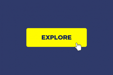
Great button design is something that most website users never think about… because when it works well, it’s almost invisible. The best buttons are easy to click or tap, have an obvious function, and help users interact with the design without thinking.
It’s a fairly simple formula, but it can be hard to design if you leave it as an afterthought.
Today, we’re looking at trends in button design, plus a few tips to help you design a UI button that people click over and over again. Give your button design a boost with these tips, trends, and ideas to spark inspiration.