Google Slides Themes / 28 May 2025
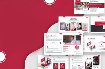
80+ Modern, Premium Google Slides Templates & Themes
Google Slides is a great web-based, free platform for creating presentations (and collaborating as you do so). There are plenty of pre-made default templates available, but they can only so so far — many are quite simple, and lack polished aesthetics.
If you’re wanting to take your Google Slides presentation to the next level, today’s collection of pre-made templates will help.
They’re all fully editable, beautifully crafted, and come ready for you to drop in your own text, images, graphics, charts, and more.
We hope you find them useful, and enjoy the pro design that your next Google Slides presentation will show off!