Font Collections
This is our series of beautiful, inspiring collections of fonts and typefaces. These articles feature bold poster fonts, decorative scripts, and everything in-between! Find the perfect font for your next design project with one of these collections.
Whether you’re looking for a particular type of font or a style of typeface that matches an event or theme, we’ve got you covered. Some of these fonts are free, others are included in an Envato Elements subscriptions, and many cost just a few dollars. The typeface makes the design, and these fonts can elevate your work to a whole new level!
Latest Font Collection Articles
25 Mar 2026
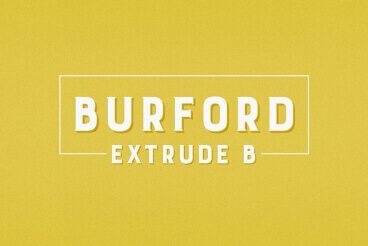
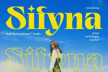
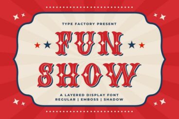
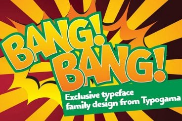
35+ Best Shadow Fonts (Free & Premium) 2025
Adding a drop-shadow to your text in Photoshop is a great way to highlight titles and make a cool text effect.
What if there’s a font that already has a shadow effect and you can use in any software? Well, that’s exactly what a shadow font is all about.
Shadow fonts are a special type of font that comes with a built-in shadow effect. Sometimes, this effect even gives a cool 3D-like look to the font as well.
In this collection, we are showing you some of the best fonts with shadow lettering that have various styles of designs and purposes. Have a look.
24 Mar 2026
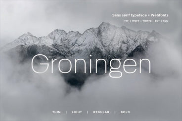
20+ Best Rounded Serif Fonts for Modern Aesthetics
Rounded serif fonts are a great way to make your typography feel soft, modern, and inviting.
They take the classic structure of a serif and smooth out the corners to create a friendlier appearance.
These fonts are perfect for designers seeking to add a touch of elegance and approachability to their projects, whether it be branding, print media, or digital design.
Each font on our list has been selected for its distinct character and ability to enhance a wide variety of design styles. From elegant to playful, there’s something here for every creative need.
Whether you’re working on a logo, magazine layout, or digital interface, rounded serif fonts make it easy to infuse sophistication with a welcoming tone.

22 Mar 2026
25+ Best Sharp Fonts in 2026 (Free & Pro)
Fonts with sharp edges are one of the most versatile typefaces you can find. They are able to seamlessly fit in with a wide range of designs from business branding to rock band logos and much more.
Today, we are highlighting some of the best sharp fonts in our handpicked collection. These fonts have clean looks and sharp edges that could cut through your competition to make your logos and bold statements stand out from the crowd.
Sharp fonts are also one of the key ingredients of minimalist designs. Explore the list below and find the perfect sharp letter font for your project. We’ve included a few free options as well.
18 Mar 2026
20+ Best Fonts for Brochures, Catalogs, Manuals & More
Creating visually appealing and effective brochures, catalogs, and manuals requires careful consideration of design elements, and selecting the right font is very important.
With so many options available, finding the best fonts for brochures can significantly enhance your project’s readability and aesthetic appeal.
This curated collection of brochure fonts is specifically tailored to elevate your print and digital materials.
Whether you’re designing an elegant catalog or a comprehensive manual, these fonts provide versatile options that cater to a variety of styles and purposes.
Explore our list to discover the perfect font for your project.
4 Reasons to Use a Premium Font or Typeface
“Typography is two-dimensional architecture, based on experience and imagination, and guided by rules and readability.” – Hermann Zapf, legendary German type designer (Palatino, Optima, Zapfino)
There are two classes of typefaces when it comes to licensing – free or premium. While there are plenty of options for each type of font, there are some distinct advantages to selecting a premium option.
Premium typefaces are often sold by larger foundries or are part of collections such as Typekit. Prices can vary widely.
- Premium fonts come with extended characters and glyphs. Have you ever run into a font that didn’t have an ampersand or comma? That’s a common problem with many free fonts, and isn’t the case with premium options.
- Premium fonts won’t degrade in quality when used at large sizes and have been tested to render on multiple browsers and devices.
- Premium fonts have a character consistently to ensure that the family looks like it goes together among different characters and weights.
- Premium fonts often include multi-language support and come with a license so you know when you are using it legally.
How to Install a Font on a Mac
Installing a font on Mac operating systems just takes a couple clicks, using the Font Book app.
After downloading the font (make sure to unzip it), double-click the font icon and a window will pop up in font book that shows the name and basic character set. Click install to add to your default font set, using default preferences. (You can change these settings in the Font Book preferences.)
How to Install a Font on Windows
Adding a font on Windows is equally simple. (Note that administrator access is required to install on Windows NT 4.0, Windows 2000, Windows XP, or Windows Server 2003.)
After downloading the font (make sure to unzip it), right click on the font file and select Install.
The alternate method is to open the Fonts Control Panel and Fonts Manager. Then drag and drop the unzipped font file into the Fonts Manager to install.
3 Tips for Pairing Fonts
Most projects aren’t a one-font design. Pairing typefaces is an art in itself, but it is a little easier with these tips to help you create amazing font pairs.
- Look for typefaces with similar shapes: Think about whether each typeface is more round or oval, thick or thin, or tilts.
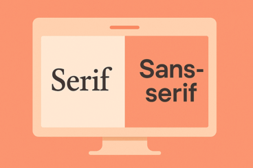
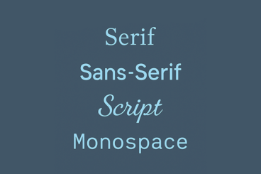
- Mix type styles: Use a serif and a sans serif or a script and sans serif. Paring different type styles is more visually interesting than mixing similar typefaces.
- Create plenty of contrast: Typography pairs need plenty of contrast to stand out. Pair fonts in different sizes, styles, color and use so that each font serves a distinct purpose.