Graphics - Page 11

Inspiring advice, tips, and suggestions for improving your graphic design skills, logo design, working with templates, and more.

5 Cliche Logo Design Trends to Avoid

How to Design a Logo / 21 Jun 2017

5 Cliche Logo Design Trends to Avoid

Logos are one of the trickiest things to get right in the graphic design world. It takes almost zero talent to make a logo — virtually anyone can do it. However, making a good logo requires a lot of insight, artistic skill, and patience.

Too often we see designers falling into the trap of rushing into a logo design project and coming up with ideas that are so overused that they’re downright cringe-worthy. Today we’re going to take a look at five logo trends that fit this description. Read on to see if any of your go-to techniques are on the list (and make a mental note to avoid them in the future!)

Are you in the middle of a logo design project? Learn more about how to make your concept stand out in our in-depth guide on how to design a logo!
Flat Design: An Evolving Trend

Graphics / 14 Jun 2017

Flat Design: An Evolving Trend

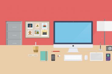
Is the flat design trend finished? We don’t think so. It’s not dead yet. But the trend has evolved to be less stark and more engaging for users.

The early days of flat design were marked by a complete lack of design elements such as shadows, gradients, or realistic elements with texture. Many of those design elements are back, but are being paired with the overall idea of flat design to create a website user experience that’s both simple and easy to engage with. Depending on what side you are on, it might be a better version of flat design.

Here’s a look at the flat design trend evolution, and where we are today.

Poly Shapes: A New Design Trend We Love

Graphics / 5 Jun 2017

Poly Shapes: A New Design Trend We Love

There’s a new favorite shape in design these days – the polygon. These affectionately called “poly shapes” are popping up on websites, posters and in printed projects. And one of the best parts of this versatile trend is that each of these designs is so different.

Polygons are shapes that are defined in elementary geometry as a “plan figure that is bounded by a finite chain of straight line segments in a loop to form a closed polygonal chain.” The shapes can have any number of sides or orientation, can be filled or hollow and can have paths and strokes that intersect. Polygons are typically flat, two-dimensional shapes, although in website projects some polygons animate move and seem to have more 3-D characteristics.

Polygons are a fun technique for new projects or can bring new life to a design that’s feeling a little stale. Here are a few projects with poly shapes to help jumpstart your next brainstorming session.

Stunning Examples of White Space… That Aren’t White at All

Graphics / 1 May 2017

Stunning Examples of White Space… That Aren’t White at All

When you think of white space in web design, examples such as Apple or Google are probably the first ones that come to mind. While these companies do a great job of using white space in their designs, there are plenty of other ways to make the most of space.. even if it isn’t always white.!

White space is an important part of your design plan. Here, we’re going to look at the importance of space as a design tool and five examples of websites that are making great use of white space (that isn’t white at all).

Designing an Infographic? 5 Elements You Must Include

Graphics / 8 Feb 2017

Designing an Infographic? 5 Elements You Must Include

Designing an infographic is just like designing a website. It starts with a concept, goals and even a wireframe.

The big difference is that all the information for an infographic is contained in one unit, whereas a website has multiple pages and ways to engage users. You can almost think of an infographic as a flat, or static, mini-website. You can also design a one-page website as an infographic!

Here are five essential elements to help you make the most of your next infographic design.

7 Rules for Creating a Simple Design

Graphics / 18 Jan 2017

7 Rules for Creating a Simple Design

Keep it simple, stupid. This concept dates to 1960 when the U.S. Navy implemented the KISS principle, which maintains that most systems work best if they are simple, rather than complicated. The same is true of pretty much any design project as well.

Most graphic designers learn about KISS early in their careers. So how can you do it? Creating a simple design is a little more complicated than you might think. Here are seven rules to design by, that help you cut away all the clutter and create a beautifully simple account.

7 Tips for Effective Use of Icons in Design Projects

Graphics / 11 Jan 2017

7 Tips for Effective Use of Icons in Design Projects

Designing icons can be a lot of fun. But once you have a good set, what do you do with them?

Icons are not just miniature links for Facebook or Instagram — they can be fully interactive cues that help lead users through a design and provide extra visual spark. Icons can be small or large, black and white or colored, flat or intricate. No matter what style appeals to you, effective use of icons can enhance usability and the aesthetic value of almost any design project.

Designing With an 80s Trend: Memphis Design 101

Graphics / 14 Dec 2016

Designing With an 80s Trend: Memphis Design 101

Every trend eventually makes a comeback. Sometimes that even applies to trends that are more difficult to understand.

Memphis design – exemplified by an 80s aesthetic with bright colors and lots of shapes and lines – is one of those concepts that has come back around again. Not many people have ever said they love the 80s design style. Love it or hate it, the bright design pattern can be a lot of fun and direct attention to the design. Here’s everything you need to know about Memphis design.

5 Tips for Mixing Photos & Illustrations in a Single Design

Graphics / 2 Nov 2016

5 Tips for Mixing Photos & Illustrations in a Single Design

Ready to take a design risk? Try mixing photos and illustrations in the same design project. A hand drawn element can add whimsy and interest to a design that includes photography. Conversely, a photo can make a more lighthearted illustrated design seem more real or important.

This technique can be a little difficult to imagine until you see a few examples of how it can work beautifully. Today’s we’re looking at this trend and providing tips and examples to help you develop creative ways to come up with a design of your own.

How to Make Color Overlays Work in Your Design

Graphics / 24 Oct 2016

How to Make Color Overlays Work in Your Design

Color is an important part of almost any design. Whether you are a fan of bright, bold hues or prefer a more minimalist black and white, how you use color can have a great impact on the overall design.

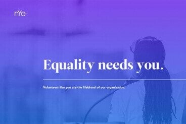
One way to use color to make a statement is with a design that incorporates a color overlay. This means that you cover an image or video with a semi-transparent colored box. The effect can add meaning to an image, bring attention to a design and help you make most of limited art choices.

Today, we’re going to look at a variety of color overlays to serve as a bit of inspiration for creating your own.

Duotone Color: Tips & Examples for This Vibrant Trend

Graphics / 28 Sep 2016

Duotone Color: Tips & Examples for This Vibrant Trend

The next big web design image trend is here, and it’s vibrant, colourful, and beautiful!

Thanks to Spotify, duotone is growing in popularity almost daily. The effect, which uses a pair of colors over a photo is striking, fun and vibrant. It’s also quite trendy, with new sites changing to a duotone format almost daily. Here are a few ways to make the most of this hot design technique.

7 Tips for Designing Consistency

Graphics / 13 Jul 2016

7 Tips for Designing Consistency

Consistency will make your design better, easier to use, and practically invisible. It gives the user plenty of room to experience the design in the way you intend.

Designing for consistency is a no-brainer in some cases and a little trickier to understand in others. Quite simply, consistency is the thread that ties together elements in a single design. It also ties together designs across a single campaign or brand, creating a product that is distinguishable, usable and effective. Take special note of all the examples below, each brand is a leader when it comes to consistent and usable design.