Fonts
Choosing the right font can make-or-break any design project. Explore hundreds of free and premium fonts. Everything from classic, vintage typefaces to bold, modern fonts that pack a contemporary punch. Find the perfect font for your next project.
Explore popular categories:
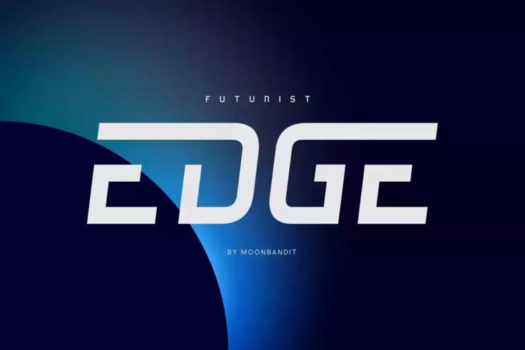
MBF Edge Font
MBF Edge is a modern and sleek font that is perfect for a variety of design projects. The font is available in both regular and italic variations, and...
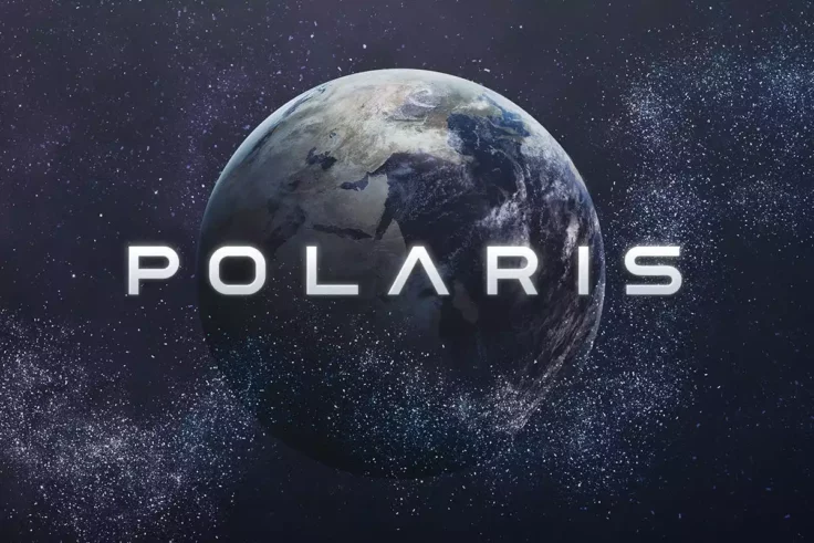
Polaris Space Font
Polaris is a space-themed font designed for futuristic projects. Polaris includes uppercase multilingual letters, numbers, and punctuation marks, maki...
Learn About Fonts
How Do I Add Fonts to Photoshop?
Learn how to add fonts and start working with them quickly.
What Is a Font License?
Learn the ins and outs of what type of font license you need for your project.
Where Can I Find Free Fonts?
Our pick of the greatest free sources for typefaces online.
How Should I Pair and Combine Fonts?
Tips and tricks for combining stylish fonts in unique and interesting ways.
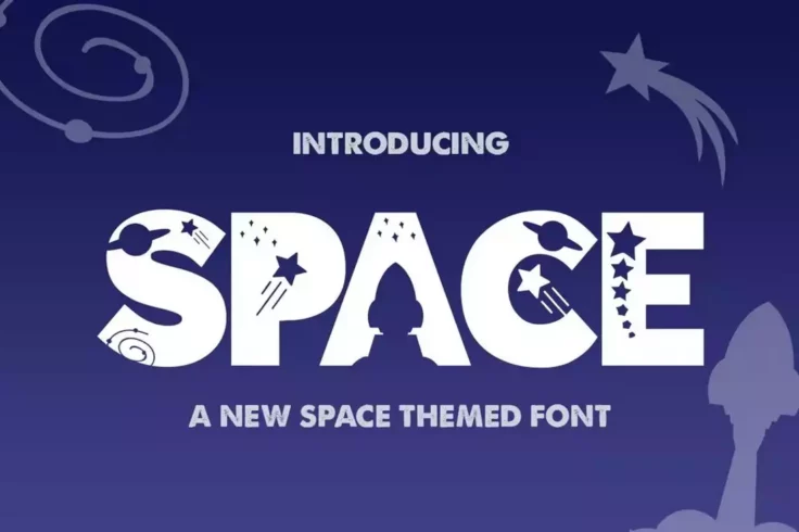
The Space Font
The Space is a captivating silhouette font that transports you to the realm of outer space. Each letter is adorned with playful and imaginative charac...
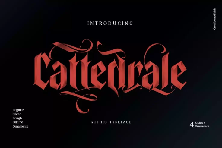
Cattedrale Font
Cattedrale is a unique font that is perfect for Gothic-themed projects. With its blackletter design and 4 different styles, this font is a great choic...
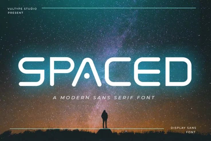
Spaced Logo Font
Spaced is a captivating and contemporary sans-serif font that exudes a futuristic aesthetic, elevating any design project it graces. With its distinct...

BiteChalk Chalkboard Font
BiteChalk is one of the best looking chalkboard fonts we’ve seen. It features a unique handcrafted design with a realistic look that’ll definitely...
Pixel Rand Font
Pixel Rand is a unique handwriting font that is designed with medium-sized pixels that are randomly positioned. With both uppercase and lowercase lett...

Street Hipster Font
Street Hipster is a typeface designed to emulate the style of street graffiti and is intended to give a hip, urban vibe to any design project it is us...
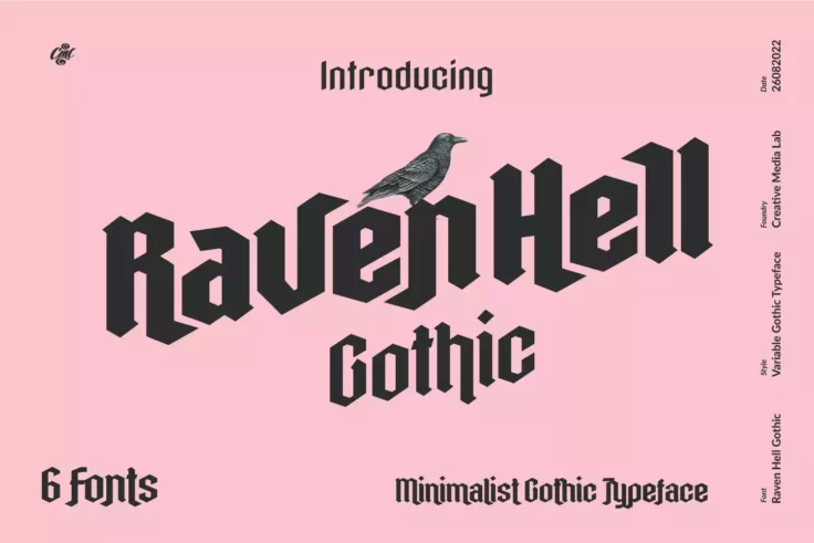
Raven Hell Gothic
Raven Hell is a modern and minimal gothic font that features a unique character design. This font is part of a font family that includes six different...
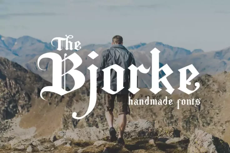
The Bjorke Font
Bjorke is a handmade font with a gothic twist that is sure to make any project stand out. This font features a unique and organic design that gives it...
Broken Console Font
Broken Console is a geometric pixel font that draws inspiration from old-school game consoles that display pixel art in the game view. The font is ava...
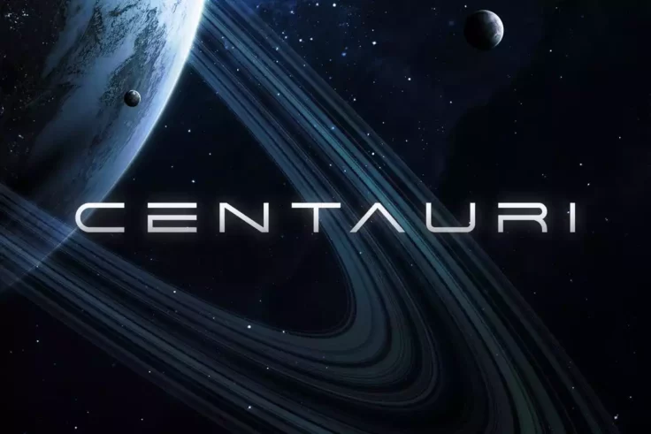
Centauri Font
Centauri is a captivating futuristic font that embodies the essence of outer space exploration. With its minimalist design and wide letterforms, it ex...
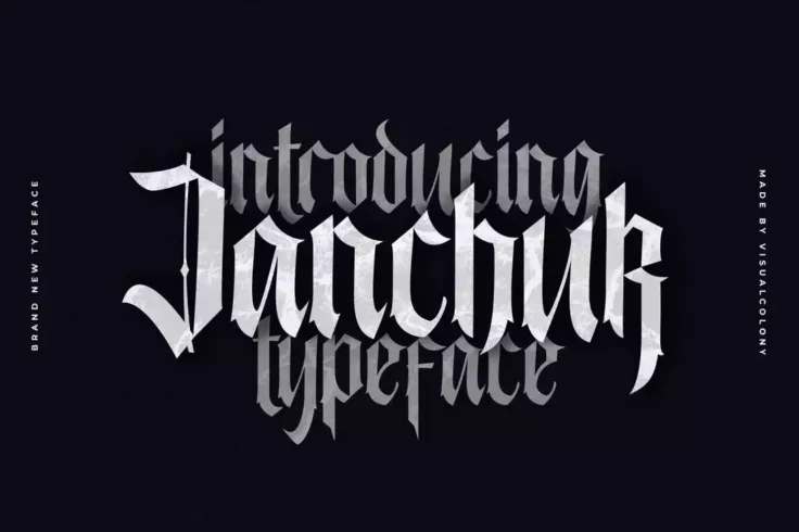
Janchuk Font
Janchuk features a distinctive serif style that sets it apart from other blackletter fonts on the market. The design of the font is also characterized...

Bruney Luxury Ligature Font
If you’re working on a monogram logo design for a luxury brand, this font will surely come in handy. This is a ligature font that features a who...
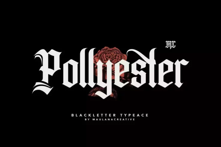
Pollyester Blackletter Old English Font
Pollyester is a stylish blackletter typeface font that combines traditional elements with modern designs. It works well in both digital and print form...
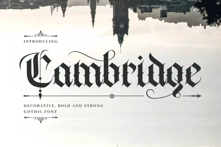
Cambridge Bold Medieval Gothic Font
Cambridge is a hand-lettering decorative font with a medieval gothic feeling. This font is suitable for a wide range of occasions, including books, lo...

Minakoe Beauty Font
Introducing the Minakoe Beauty Font, a modern and expressive Serif style font with a distinctly feminine elegance. It’s a creative asset that br...
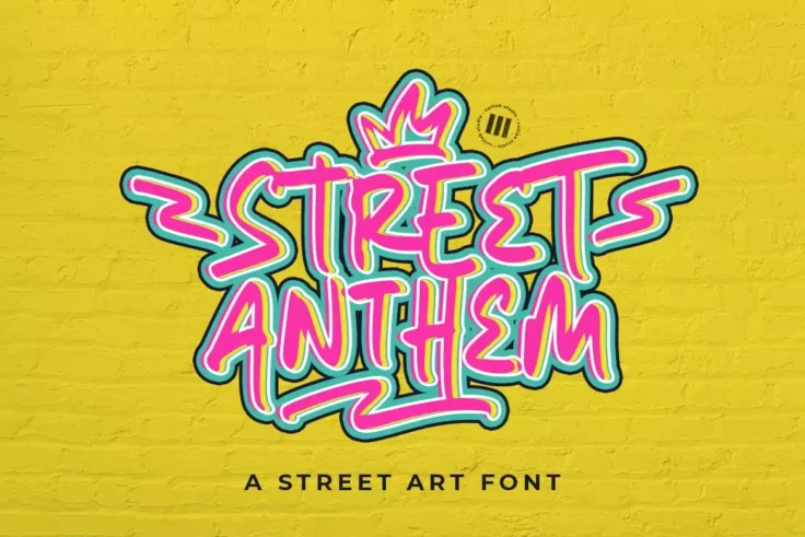
Street Anthem Edgy Font
Street Anthem Edgy Font is the ideal creative asset for any urban themed design work. Whether it’s a wild display, eye-catching social media pos...
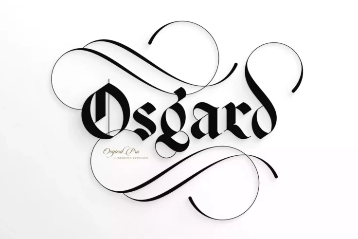
Osgard Pro Font
Osgard Pro is a powerful and luxurious typeface that combines the fluid curvaceous elements of Romanesque typography with the Gothic style of Blacklet...
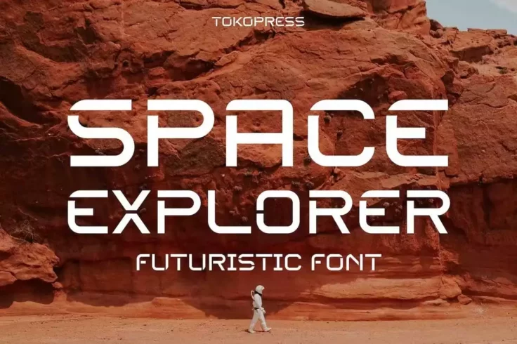
Space Explorer Font
Space Explorer is an exceptional choice for creating captivating and impactful titles for posters and banners. With its sleek and futuristic design, t...
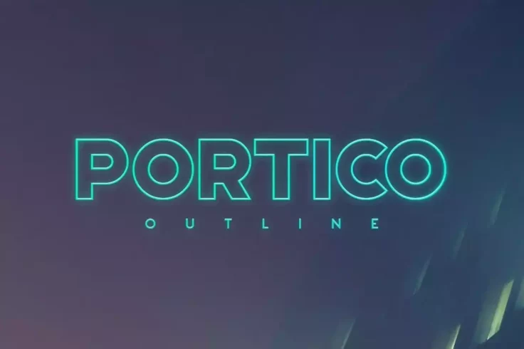
Portico Outline Font
Portico is a popular font choice for outlining in sci-fi, modern, avant-garde, or futuristic design projects. Its bold design makes it ideal for use a...
FAQs About Fonts
What are the different types of fonts?
Fonts can be divided into several categories based on their characteristics. The most common categories include Serif fonts, Sans Serif fonts, Script fonts, and Display fonts. Serif fonts have small lines or strokes attached to the ends of larger strokes in a letter or symbol. Examples include Times New Roman and Georgia. Sans Serif fonts, such as Arial and Helvetica, do not have these extra strokes.
Script fonts mimic handwriting and calligraphy. They can range from formal types like Old English style to more casual styles like Brush script. Display fonts are typically used for headers or logos rather than body text, as they can be a bit extravagant for regular reading. They come in a large variety of styles and are often used to convey a specific mood or theme.
What is a web font and how does it differ from a desktop font?
A web font is a font that is used on a website or a web application. Unlike desktop fonts, they are designed to be used on a web platform and to be compatible with different browsers and devices. A web font is hosted on a server and loaded into the user's web browser as needed, thus allowing websites to use typefaces that aren't installed on visitors' computers.
Desktop fonts, on the other hand, are fonts that you install directly onto your computer or workstation. They can be used in any application on your computer like Word, PowerPoint, or Photoshop. Unlike web fonts, they are not designed to be used on a web platform. Each type has its specific uses, and the main difference between them is where and how they are used.
How do I install a font on my computer?
Installing a font on your computer is typically straightforward. First, you download a font file from a trusted source. The downloaded file would usually be in .ttf or .otf format. On a Windows computer, you just right-click on the downloaded font file and select 'Install'. Alternatively, you can go to the 'Fonts' folder in the Control Panel and then drag and drop the font file there.
On a Mac, you open the downloaded font file, which should open in Font Book. From there, you simply select 'Install Font'. For both Windows and Mac, after installing the font, it should be available for use in your applications. Note that some applications may require a restart to register the newly installed font.
Why does a font matter in design?
Fonts play a crucial role in design as they help establish the mood, evoke emotion, and set the tone of the message. The typography you choose can make your design appear serious, comedic, light-hearted, professional, or even whimsical. An inappropriate font can miscommunicate the intended message and put off your audience. Ensuring you choose the right font can create a strong impression and enhance the impact of a design, whether it's a website, poster, or business card.
Moreover, fonts are significant for readability and legibility. Some fonts are more readable than others and make the text easy to scan at a glance. For example, for longer text, it's usually better to use a Serif or Sans Serif font. On the other hand, Script or Display fonts are typically suited for headlines or short pieces of text.
What is kerning and why is it important in font usage?
Kerning refers to the adjustment of space between individual letter pairs in a typeface. Not to be confused with tracking, which adjusts the spacing uniformly over a range of characters, kerning is specific to pairs of letters that may create an awkward or irregular visual space, for example 'AV' or 'WA'. Effective kerning ensures better legibility and aesthetic outcomes in typography. Without proper kerning, a word can look unbalanced, which can affect readability.
This procedure is particularly important in logo design and headlines, where type is at a large size, and kerning issues are more noticeable. While most software offers automatic kerning, often manual adjustments need to be made. Remember, the goal is not to create equal space between letters but to create the illusion of evenly distributed space, making the word visually pleasing and easy to read.